A Reminder Why “Design for Delight” Matters
PROJECT: SUKII (soo-kee)Enhanced the grocery delivery app experience using custom illustrations and humor to defuse a stressful situation during the pandemic in Manila, Philippines.
Designing Through a Cultural Lens
Returning to My RootsI grew up in the Philippines’ busy capital and am no stranger to city life. However, life in Manila during the pandemic proved challenging for many families when purchasing food and supplies because of the country’s Enhanced Community Quarantine that took effect for all citizens in 2020.
Visual/UI Design by me. UX by Aby Carpio. Dev/Code by Les Carpio.
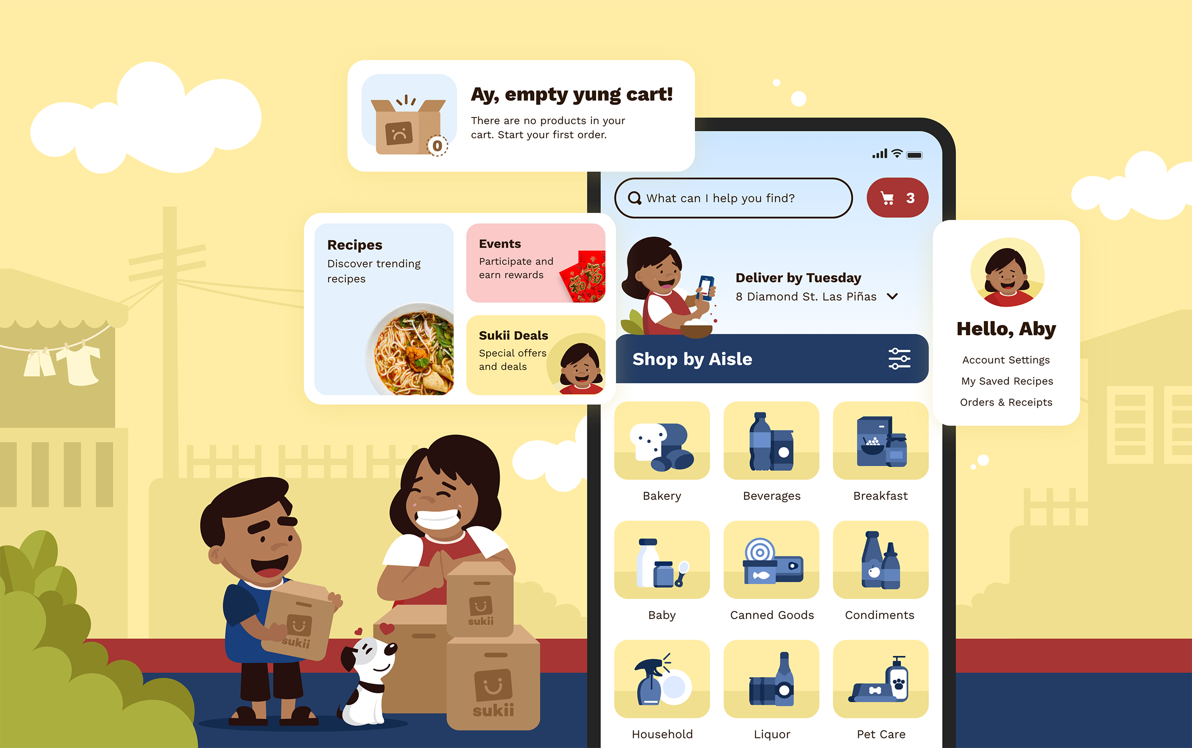
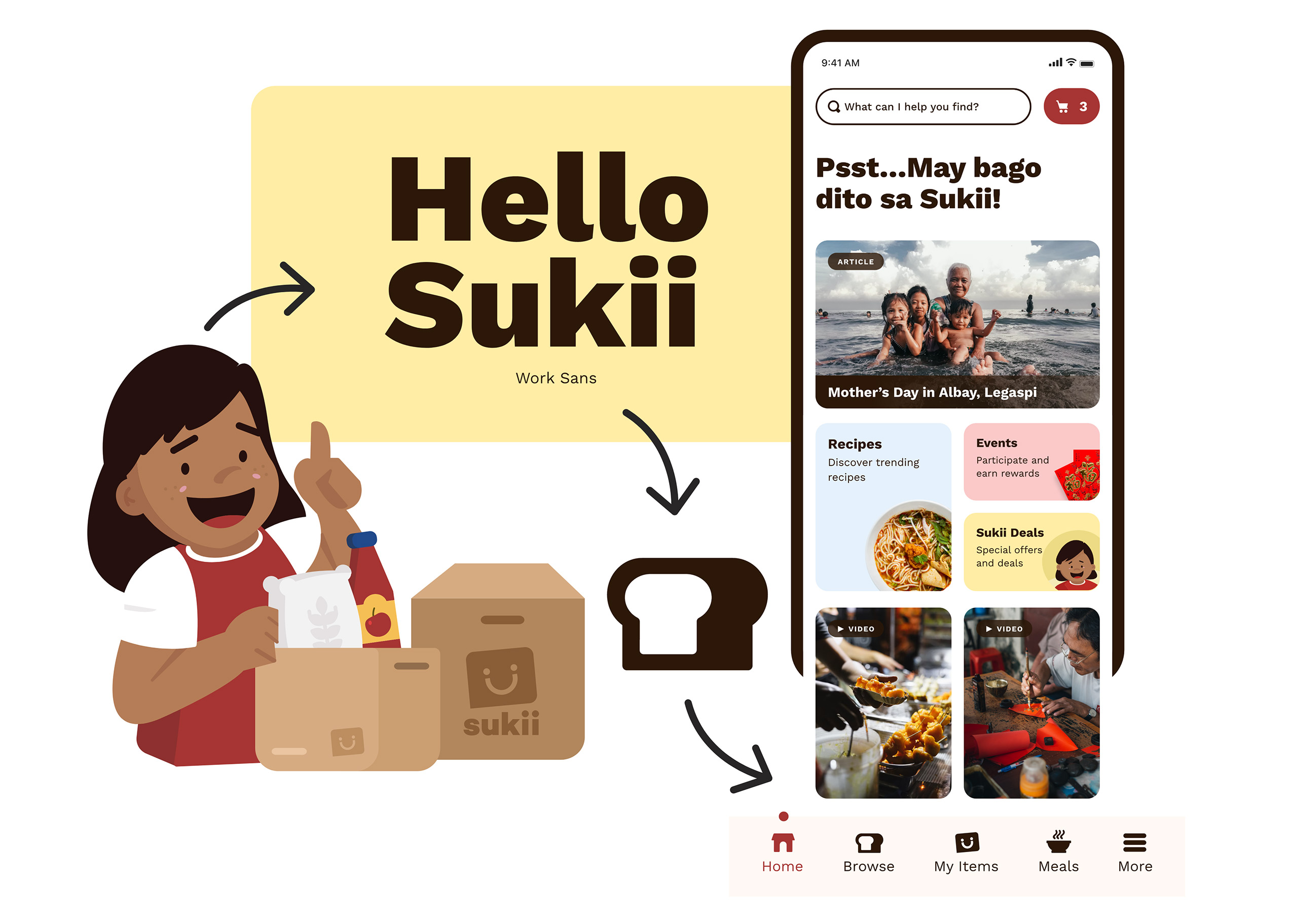
Sukii Pop-Up Screen: While there were only a handful of established Philippine shopping apps at the start of the pandemic, we shifted our focus and efforts to branding to create a deeper understanding of visual storytelling through illustrations.
A Meaningful Opportunity: The Power of Illustrations
Sukii (soo-kee) is a mobile delivery app that provides grocery deliveries in Parañaque, Manila. We used illustrations to connect with our users, inject humor and delight into our designs, and create something memorable and positive during difficult times.
Project Name Origin: Sukì [noun] means customer of long-standing in Tagalog.
“Various grocery chain competitors in Manila offered online and mobile delivery services, but working Filipinos didn’t want to use them.”
Why? Competitor apps embodied most of the following below:
Overwhelming Ads / No Branding
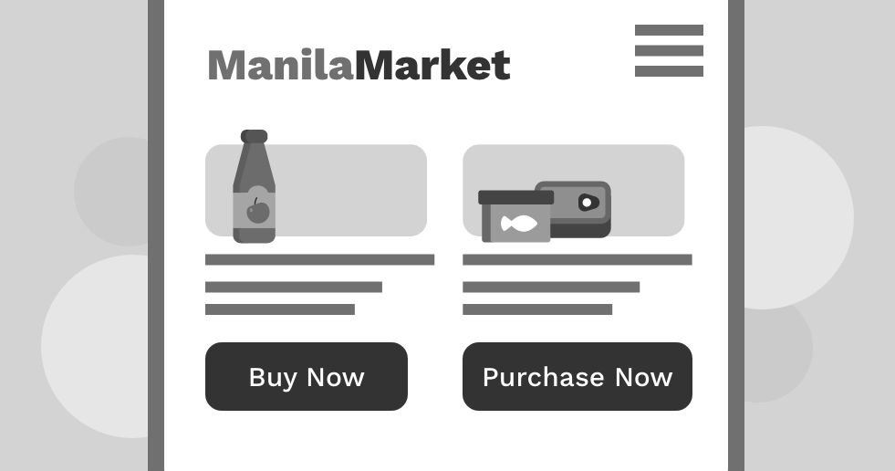
Inconsistent Messaging
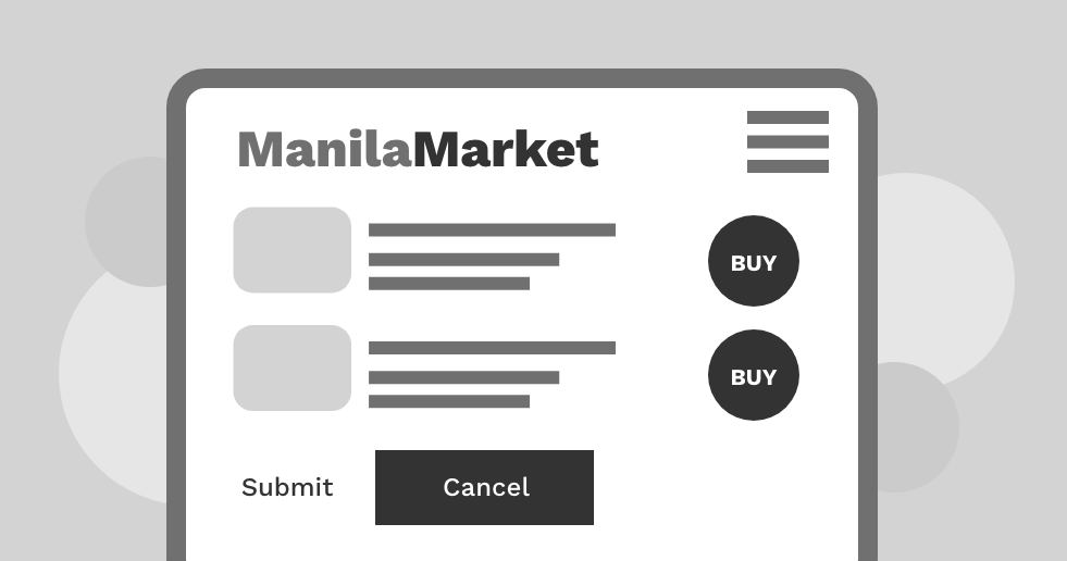
Confusing UX/UI

No Target Audience
Roles and Responsibilities
My Role
Visual Designer
The Team
1 UX/Research/Marketing, 1 Developer (iOS), 1 Visual Designer
Timeline
July 2020 - August 2022
My Key Contributions
UI Design, Illustration and Character Design Research, Concept Ideation
A New Approach to Imagery
Hello, Filipino Comic Books!I remember reading my big brother’s comic books as a kid. Many talented Filipino artists, known for their simple pen-and-ink drawings, inspired the design of Sukii’s character and style, which Filipinos can appreciate and that capture the core of Filipino humor.
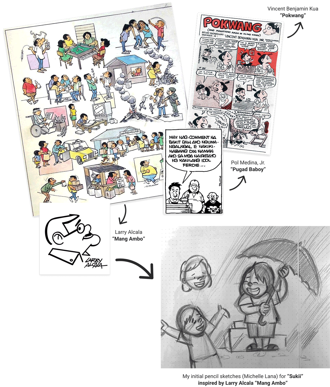
I created initial sketches and settled on a style that would help capture or communicate a specific feeling and help others feel seen and understood (bottom right).
Embracing Manila’s Female Demographic
In a typical Filipino household, adult women are usually the primary grocery shoppers. While Sukii aims to represent the diverse Filipino population, we chose to focus on this cultural norm and embrace the female demographic of Manila to embody Sukii’s character.
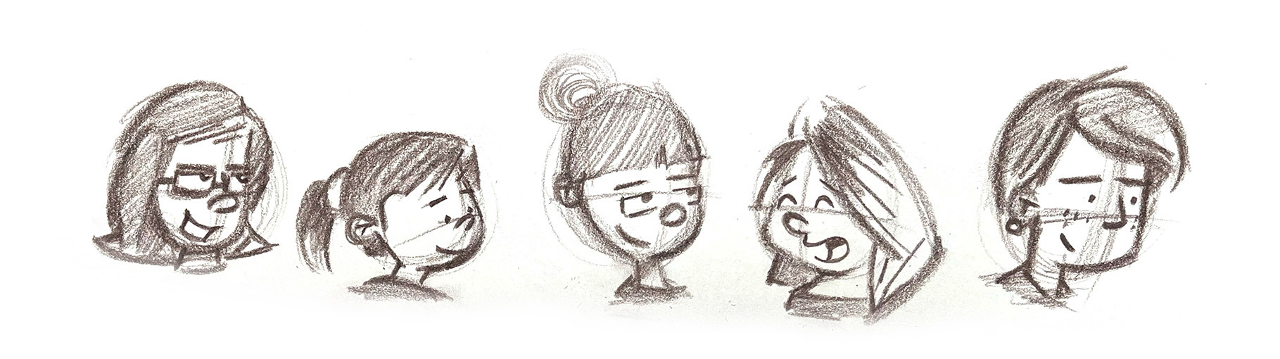
Initial variation pencil sketches for Sukii’s character

Early illustration explorations using a stroke technique paired with a two-toned color scheme
“By referencing real photos of our friends, families, co-workers, and neighbors in Manila, we were able to hone Sukii’s character into something that all Filipinos can identify with.”
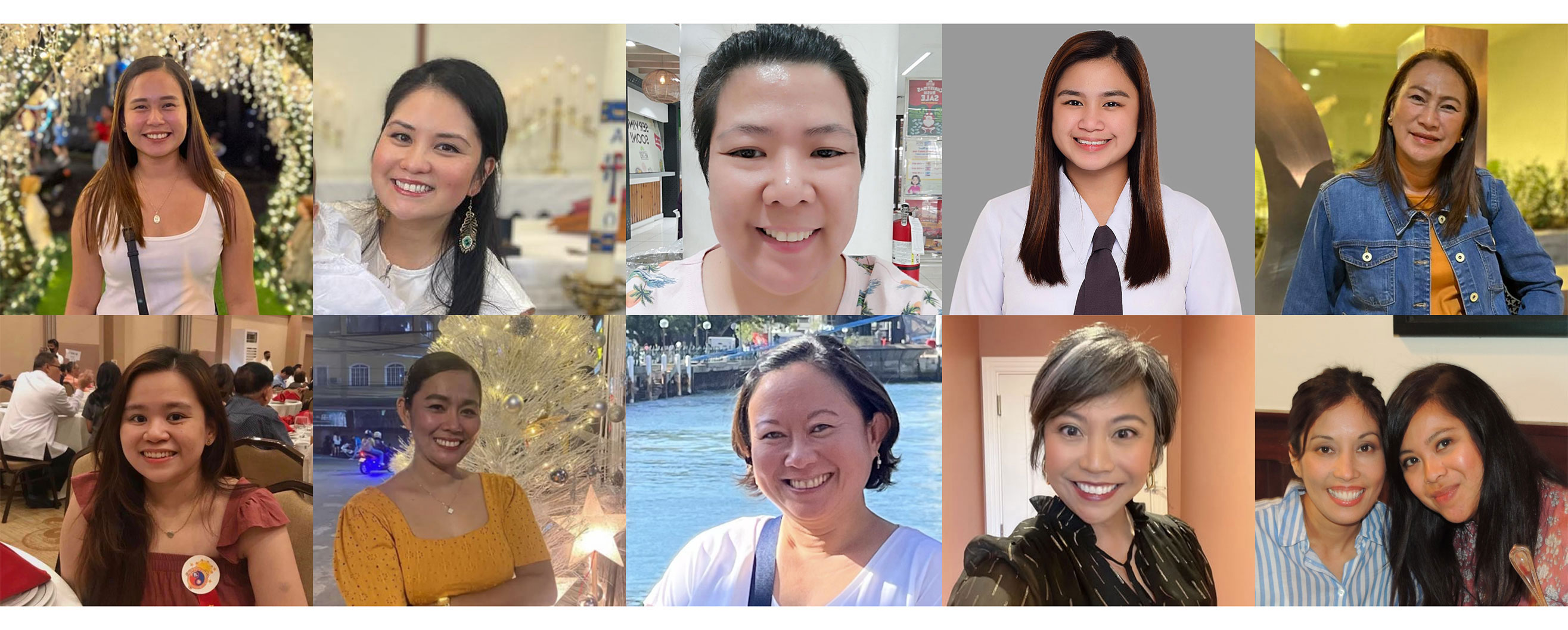
Reference photos of friends, co-workers, and neighbors in Manila, Philippines
“After a few iterations, I chose to move away from cartoon people outlined in blue and grey, as they didn't align with Sukii’s commitment to inclusivity.”
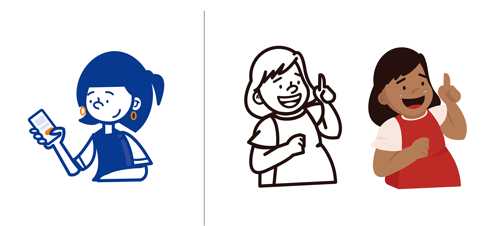
Before (left), the design used strokes and two-tone patterns. After (right), it switched to flat, rounded shapes and deeper colors. While it was a huge improvement, I still felt the pressure to represent the Filipino people respectfully and without offending anyone.
“Sukii’s rounded illustration style significantly influenced our typography and iconography design, streamlining our overall UI and branding.”
Sukii’s rounded illustration style helped us develop our iconography and UI elements and select complementary fonts. This combination ensures the design works well across various platforms and screen sizes.
Exploring Our Design Direction
Color Brand
Gosh, Darn It. Color Is Hard!Color meanings in different cultures revealed fascinating insights into cross-cultural communication. When selecting a color palette for Sukii’s user interface and brand, it was crucial to respect Filipino culture, traditions, and artistic expressions.
1. Colors red, blue, and yellow should be used to reflect Filipino identity
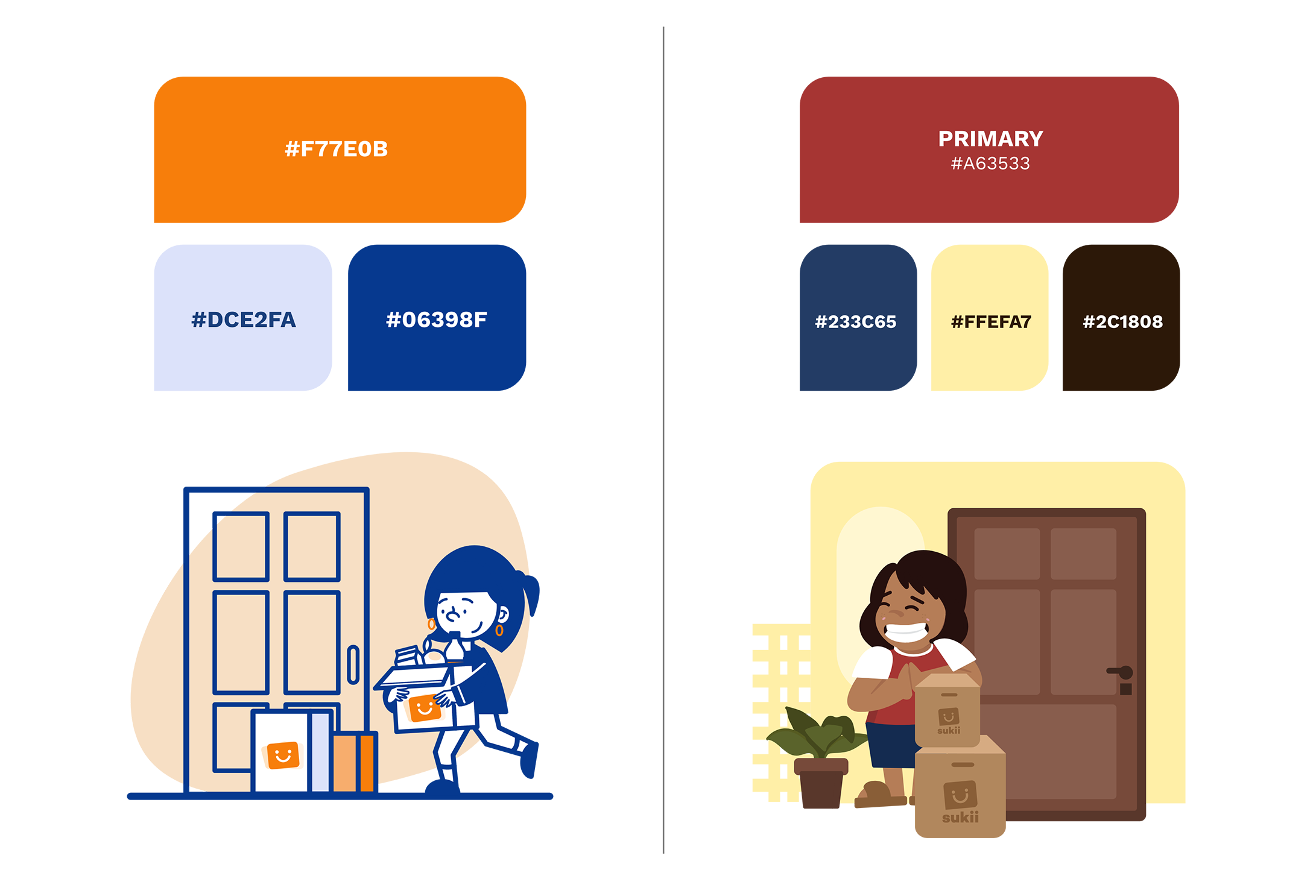
Before (left), generic colors felt cold and uninspiring. After (right), I wanted Sukii to embody the courage and fiery spirit of the Filipino people. Incorporating the Philippine flag's colors brought visual interest and emphasized our patriotism, especially during challenging times.
2. The use of “red” should not denote a negative connotation
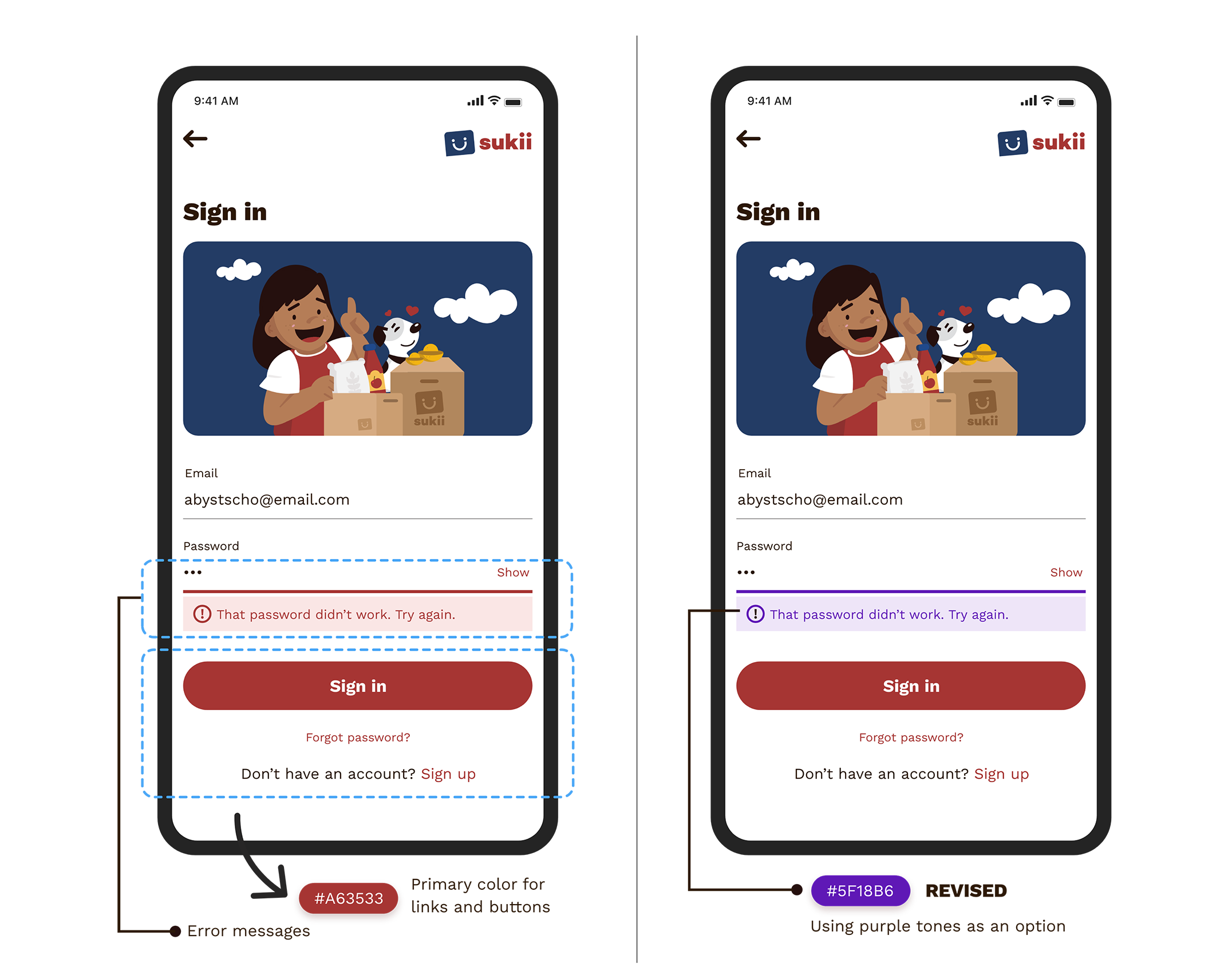
In many Asian cultures, red represents luck and success, so we chose it as the primary color for Sukii’s interactive controls. However, red is also linked to error states, which could cause confusion. To address this and avoid negative connotations, we opted for purple for error messages, allowing us to uphold brand clarity while respecting the positive meaning of red.
3. Use the Philippine flag colors for inspiration and reference
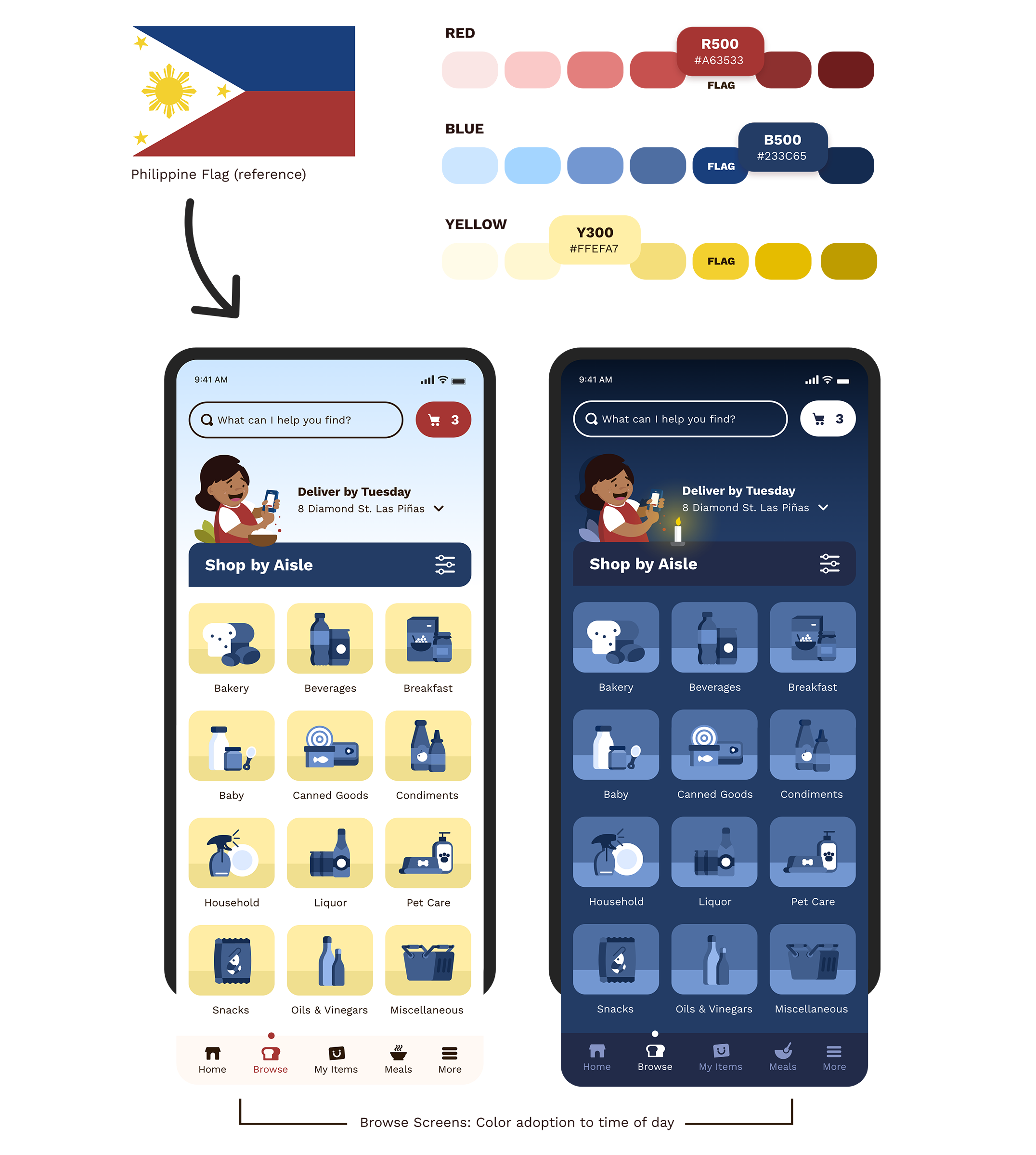
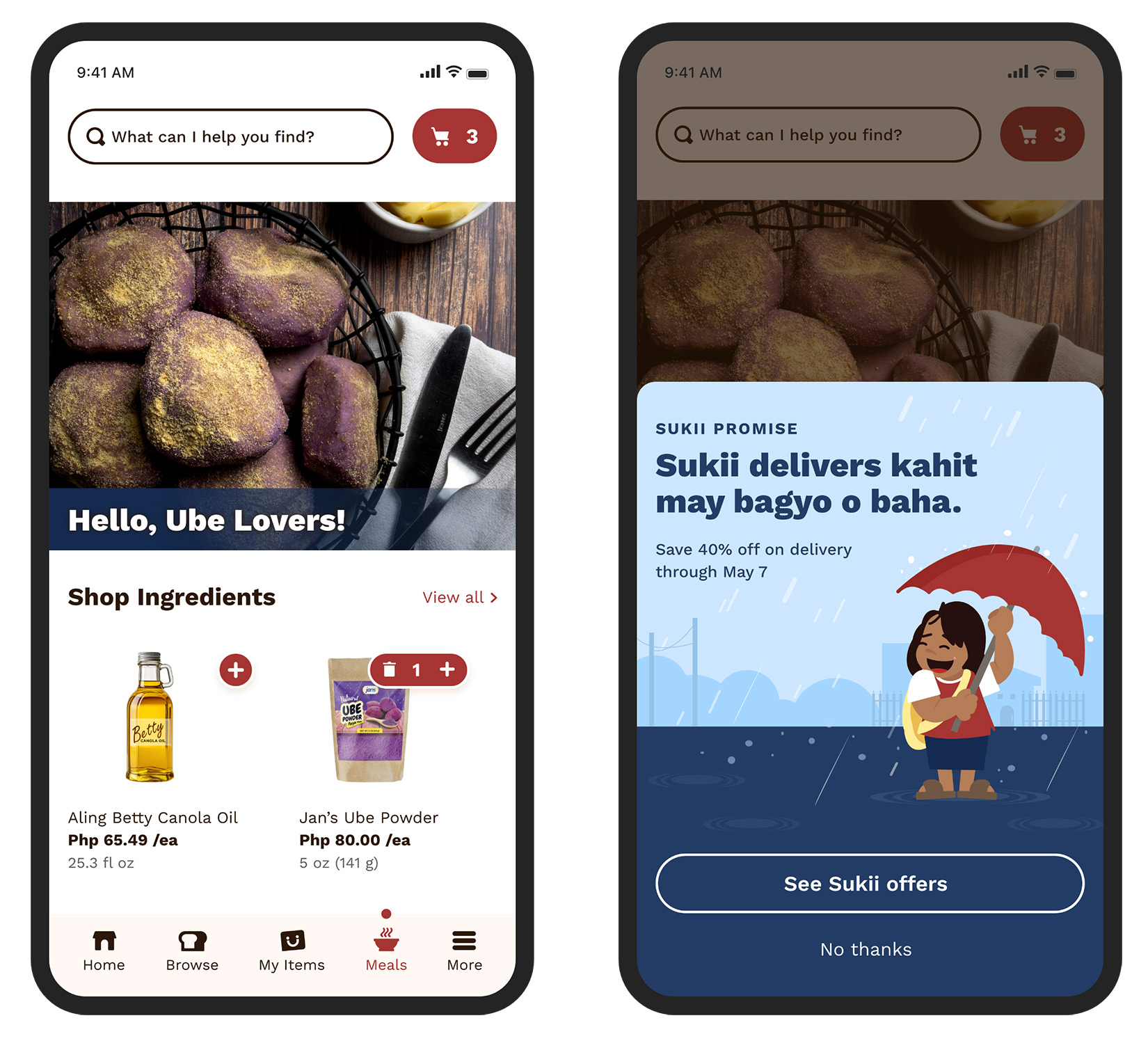
Browse Screens (left, right): Choosing a color palette inspired by the Philippine flag was easy with red, blue, and yellow. However, these colors felt too strong, so we decided on softer/muted shades that toned down the palette while still honoring the flag.
4. Pick a suitable color scheme that ensures a light and pleasant look
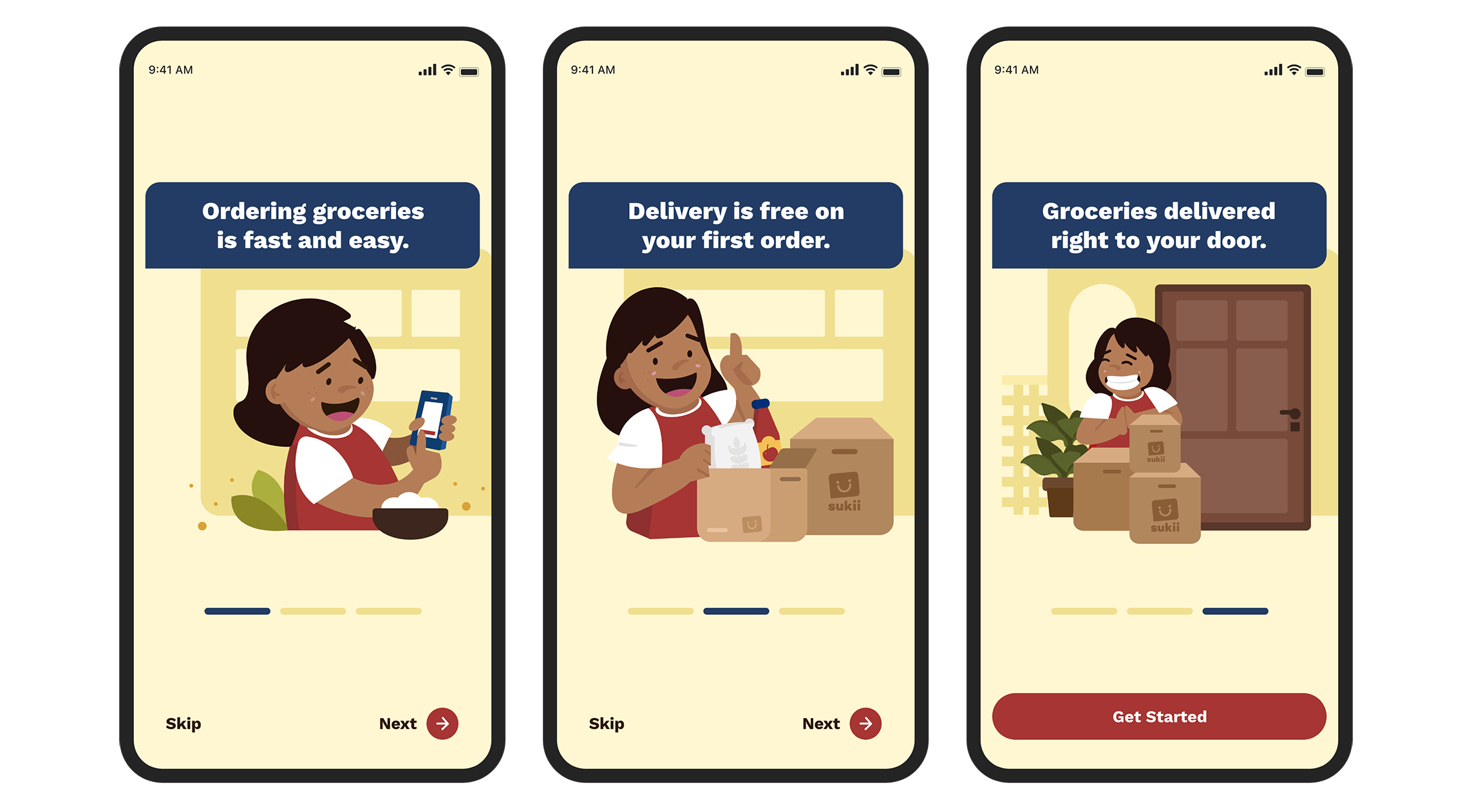
In designing Sukii’s onboarding experience, we selected color pairings from various shades to soften our color palette. These pairings were complemented by illustrations to encourage users to interact with our app.
A Little Humor Goes a Long Way
Copy and Messaging
Fusion of Tagalog and EnglishI collaborated with our marketing manager to enhance our tone and messaging, incorporating Tagalog in various sections of the app to reflect Filipino humor and create a more personal experience. We even turned our snack bars into something fun!
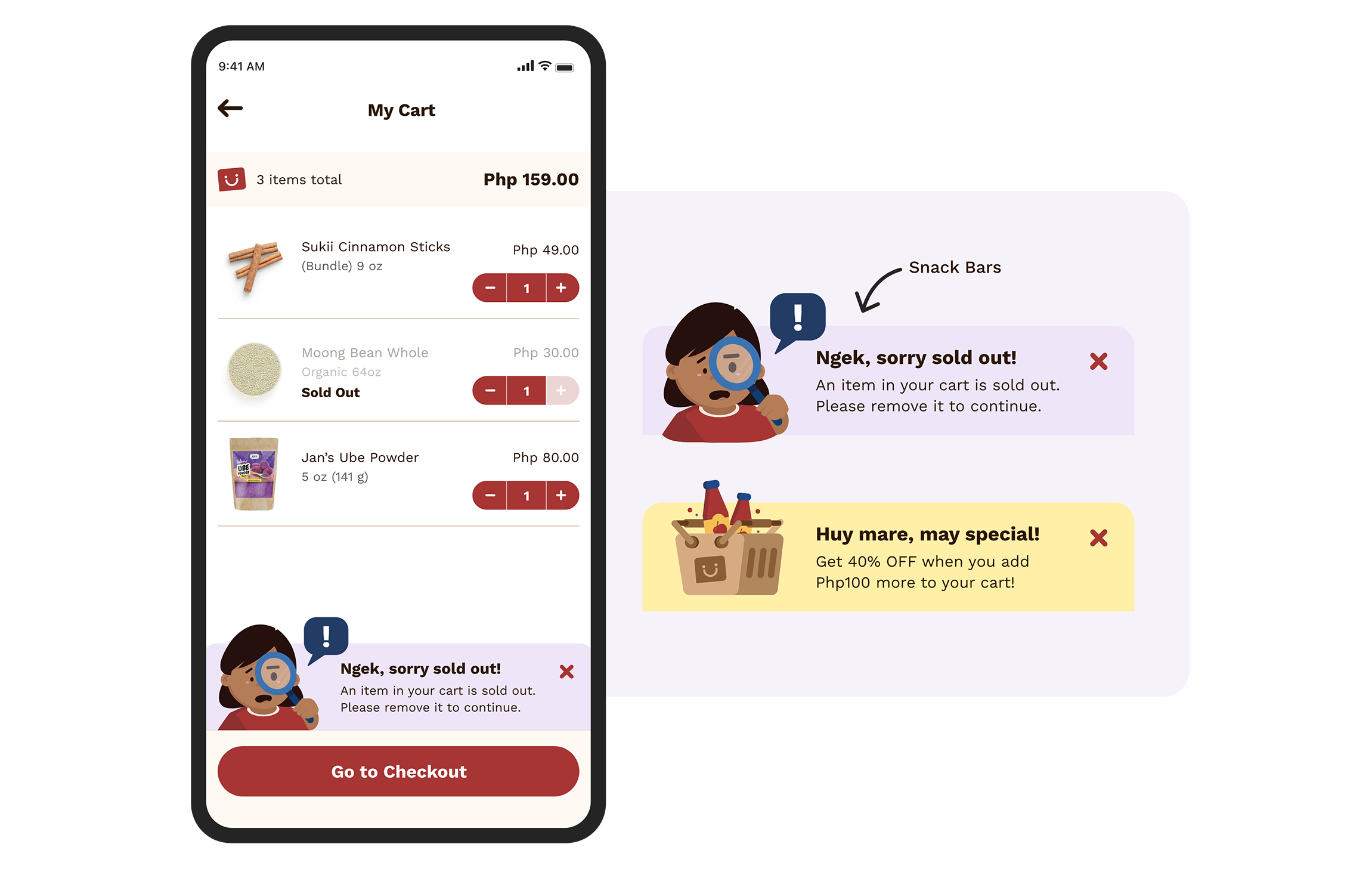
We used custom snack bars on the "My Cart" screen to showcase our illustrations and personalized messages, helping users feel connected. The word "Ngek" (pronounced nee-yek) is a Tagalog slang term people use to express surprise or disbelief in casual conversations or online chats.
“Being funny is tricky. Hitting the right tone on the first try was hard, but testing our visuals with the Filipino community led to the insight that 80% of users wanted a humorous approach to messaging.”
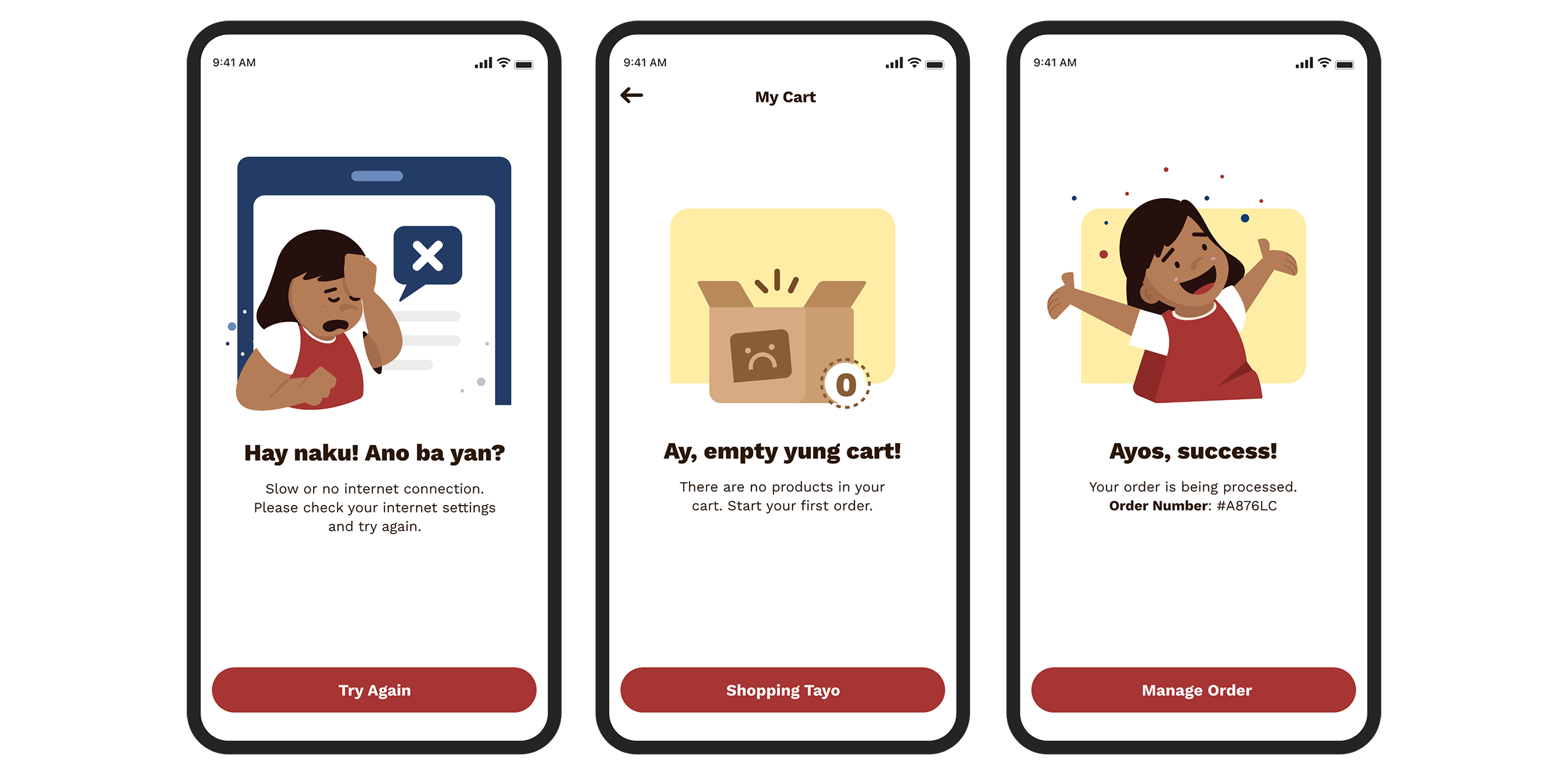
Error Messaging (left), Empty State (center), Confirmation (right): Our aim was to turn the potential frustration of encountering an empty view or error state into a more enjoyable experience, making interactions more fun for our users.
“Sukii reminds me of a woman named Ms. Betty who owned a small convenience store. She would give me candy every day after school. Nostalgia can be soothing, which makes me happy, especially during challenging times!”Joanne Pammit, Neighbor
Outcome and Impact
Reflections and What I Learned
The illustrations made a significant impact on our designs, strengthening user connection and engagement. The Filipino community especially appreciated the increased presence of Sukii throughout the app, which played a key role in our snack bar improvements. These visuals not only enhanced the user experience but also helped create a deeper emotional bond with the app.
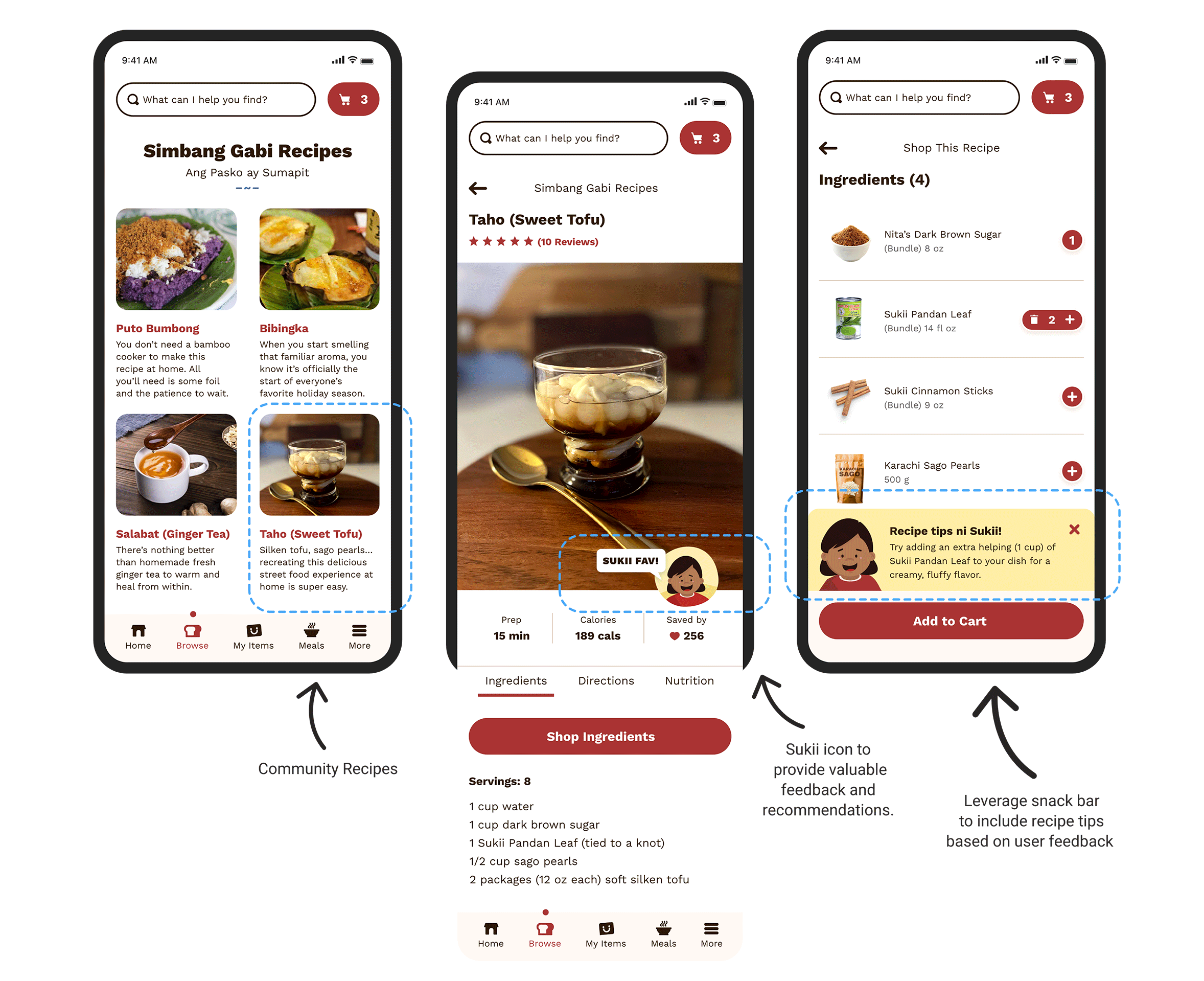
We plan to enhance our snack bars and introduce Sukii throughout the app. Our recipe page is an excellent area to integrate Sukii to guide our users with their next steps.
Project Outcome:
-
Personalized illustrations set our designs apart from competitor apps, which helped build trust in Sukii among our particpants.
-
Our target delivery date was significantly delayed due to resource constraints, as half of our team was based in Manila during the peak of the pandemic. Although we were unable to launch Sukii to the market, we gained some other marketing projects as a result.
-
As a three-person team, I took the initiative to support additional research and development for marketing and testing due to a lack of resources.
Next Case Study
NF Branch Locator