Does a Rebrand Truly Impact User Experience?
PROJECT: NFO BRANCH LOCATORReduced support calls and increased member engagement by redesigning the brand identity and functionality of a credit union’s branch locator website.
Redesigning Navy Federal’s Branch Locator
Navy Federal Credit Union, the world’s largest credit union serving millions of military members and their families, recently refreshed its homepage branding. With over 300 branches worldwide and 24/7 customer service, the credit union recognized the need to update its outdated branch locator page.
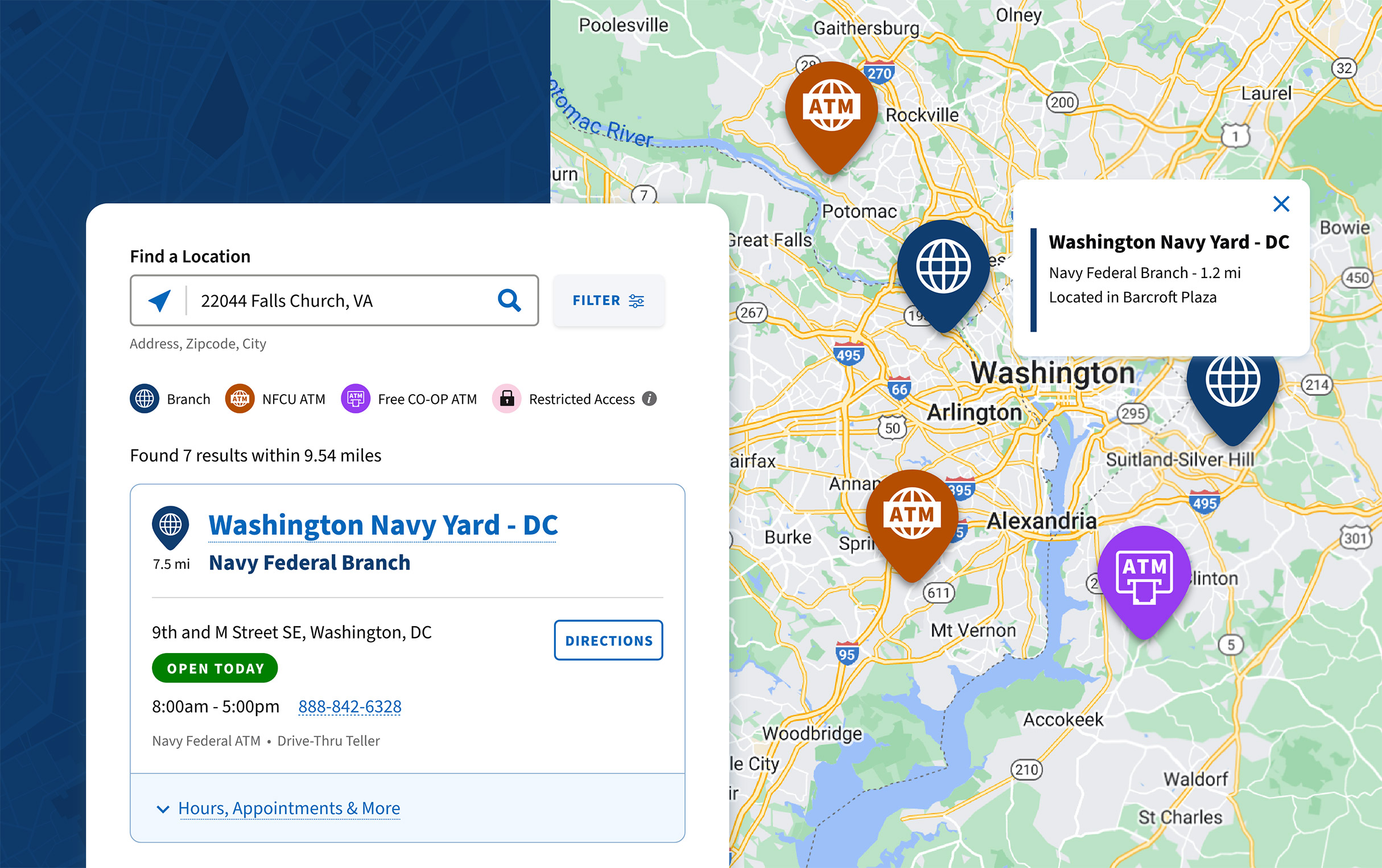
Branch Locator (New Experience) Desktop and Responsive:
Visual Design by me. UX Design by Jasmine Lewis.
Branch locator page new experience (Desktop and responsive view)
Roles and Responsibilities
My Role
Lead Visual Designer
The Team
1 UX Designer (Jasmine), 1 Visual Designer (Me), 5 Web Developers, 1 Web Accessibility Specialist, 2 Project Mgrs
Timeline
6 months
My Key Contributions
UI Design, Concept Ideation, Accessibility Annotations, VoiceOver and Keyboard Testing
Evaluating Past Experiences
Pain Points and Challenges
The previous branch locator page was effective in its time, but it lacked visual cues, had a challenging UI, poor mobile compatibility, and no longer provided an engaging experience, which led to an increase in customer support calls.
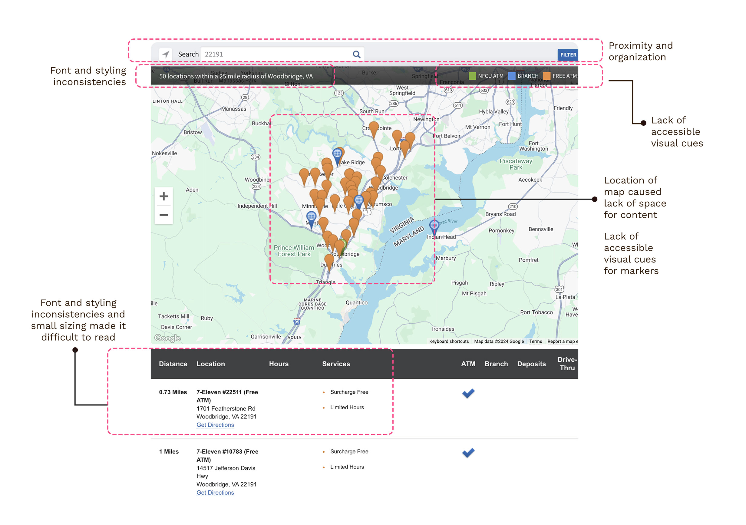
Previous Experience: Branch Locator Page (Desktop View)
“To address our pain points, we tested copy, messaging, and visual treatments, iterating on each piece of feedback to focus on our members’ journey.”
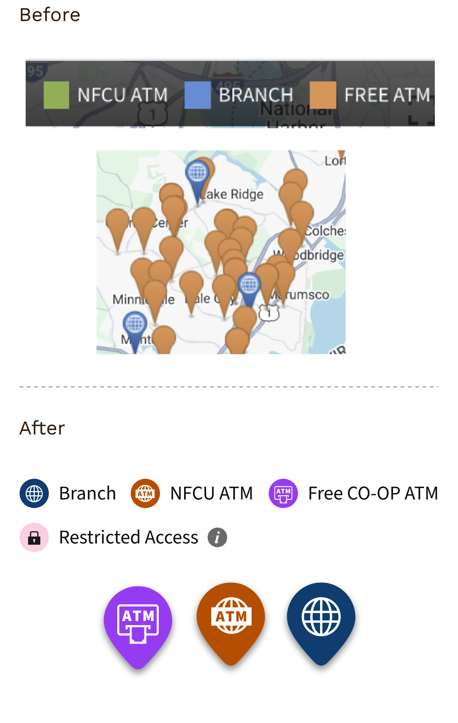
Inconsistency in fonts and sizing made items on the branch locator map challenging to read.
Several accessibility issues, such as the legend component and map markers, lacked visual cues, including common icons and colors, to help individuals who are colorblind differentiate between each branch type.
The search field and filter are too far apart, making it hard to see them as part of the same group and resulting in disorganization.
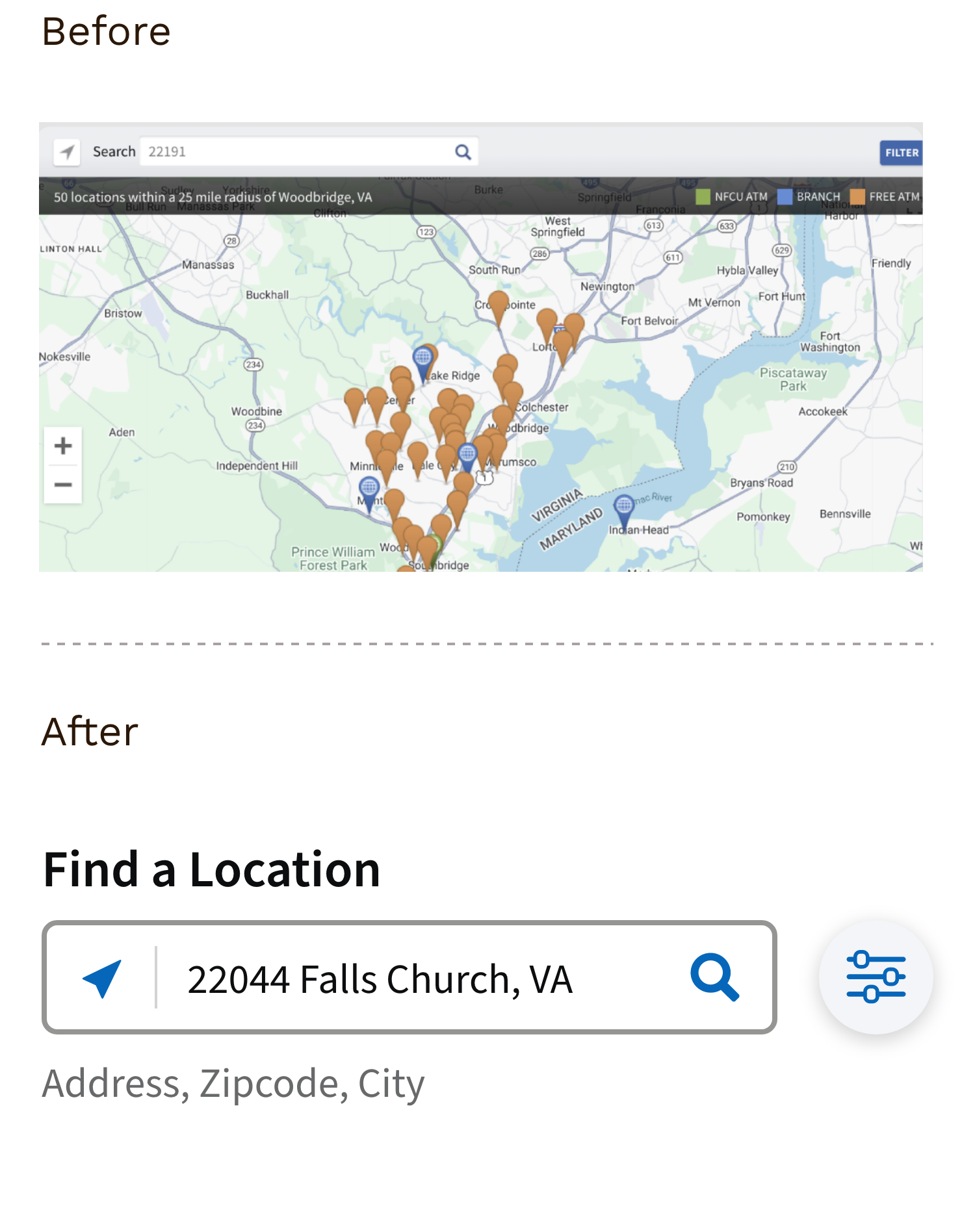
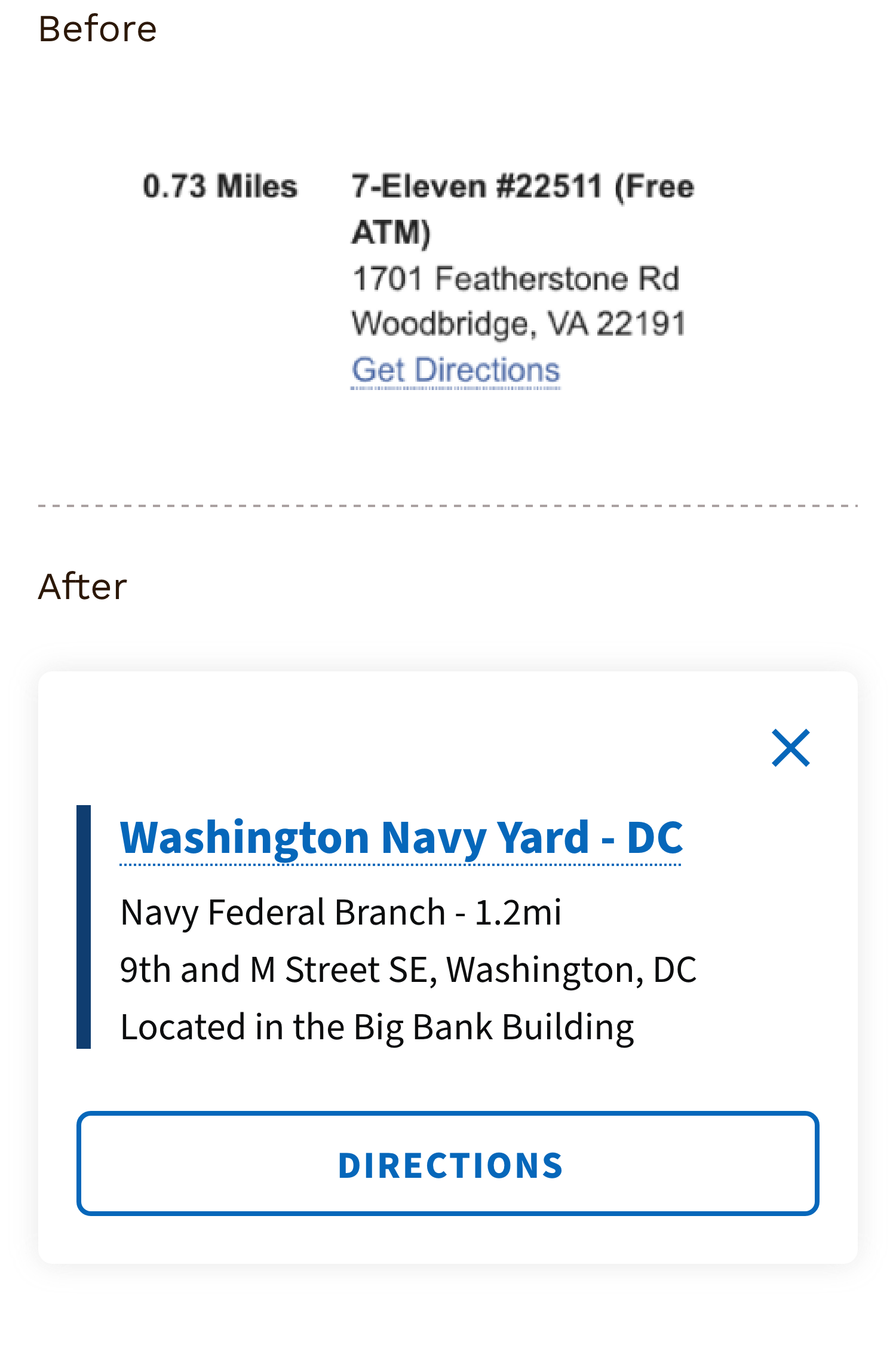
Lack of spacing and organization for interactive elements made it difficult for users to tap or locate important information, such as directions, branch hours, branch details and filtering.
Solutions That Make a Difference
TESTING AND ITERATIONS
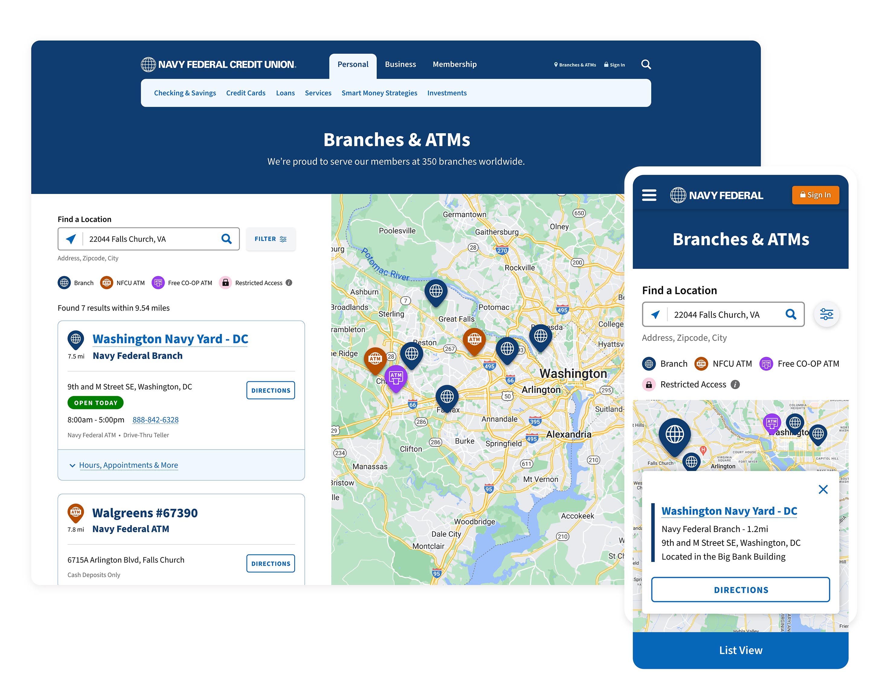
Importance of Branch Hours: Members on the Go!User testing showed that our members, particularly those using their phones, wanted the ability to easily view branch hours and book appointments directly from the list view. This enhancement enables members to filter effectively for specific locations, including clear markers for restricted-access branches.
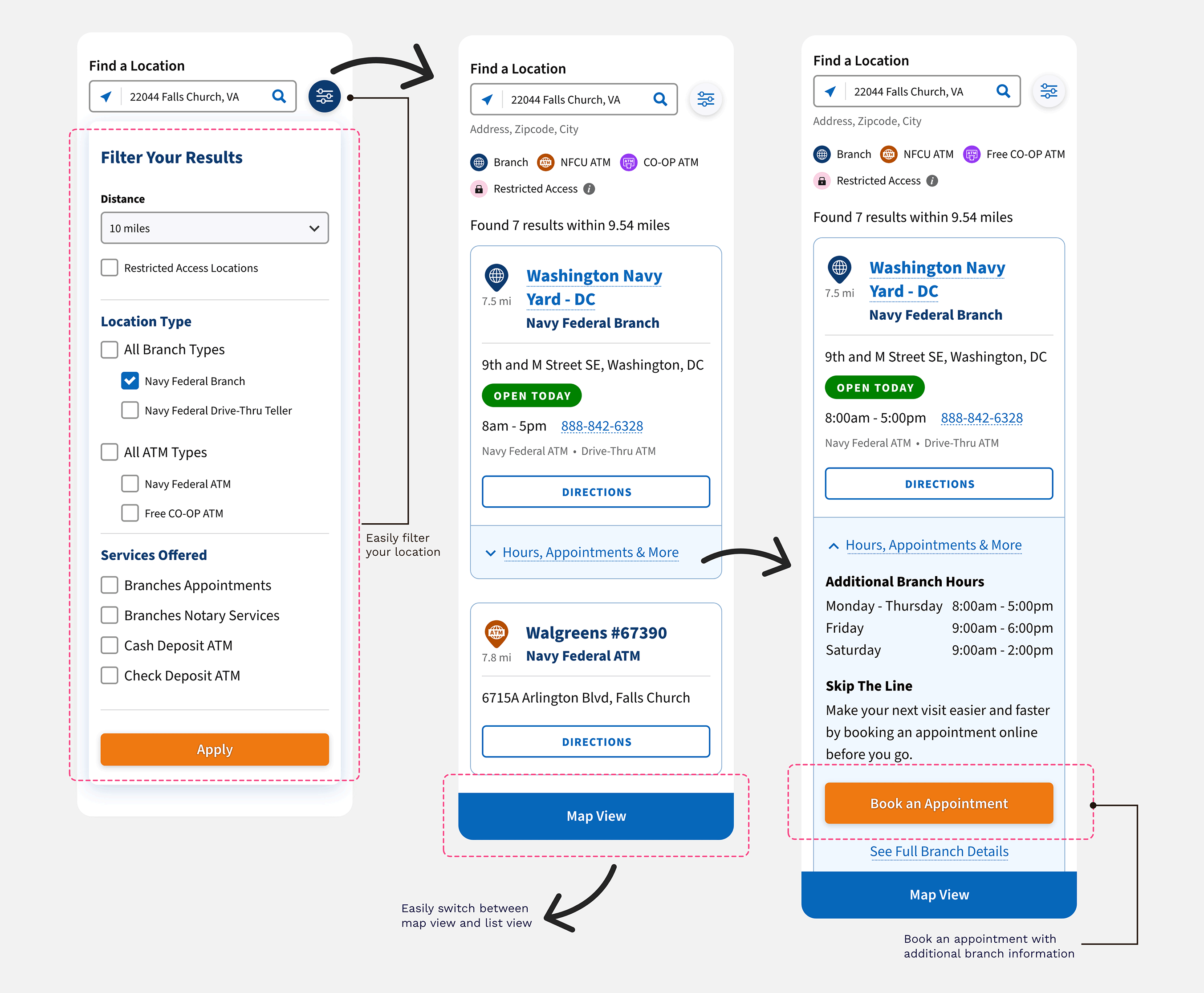
Branch locator list view emphasizing branch hours and appointment options, with seamless switching between map and list views.
Fresh Design = Enhanced Experience
BRAND REFRESH
Larger Fonts and Digestible ContentAs part of our brand refresh, we have implemented larger fonts. This simple change has significantly improved the scalability and legibility of the branch page, making it easier for users to read and understand the content quickly.
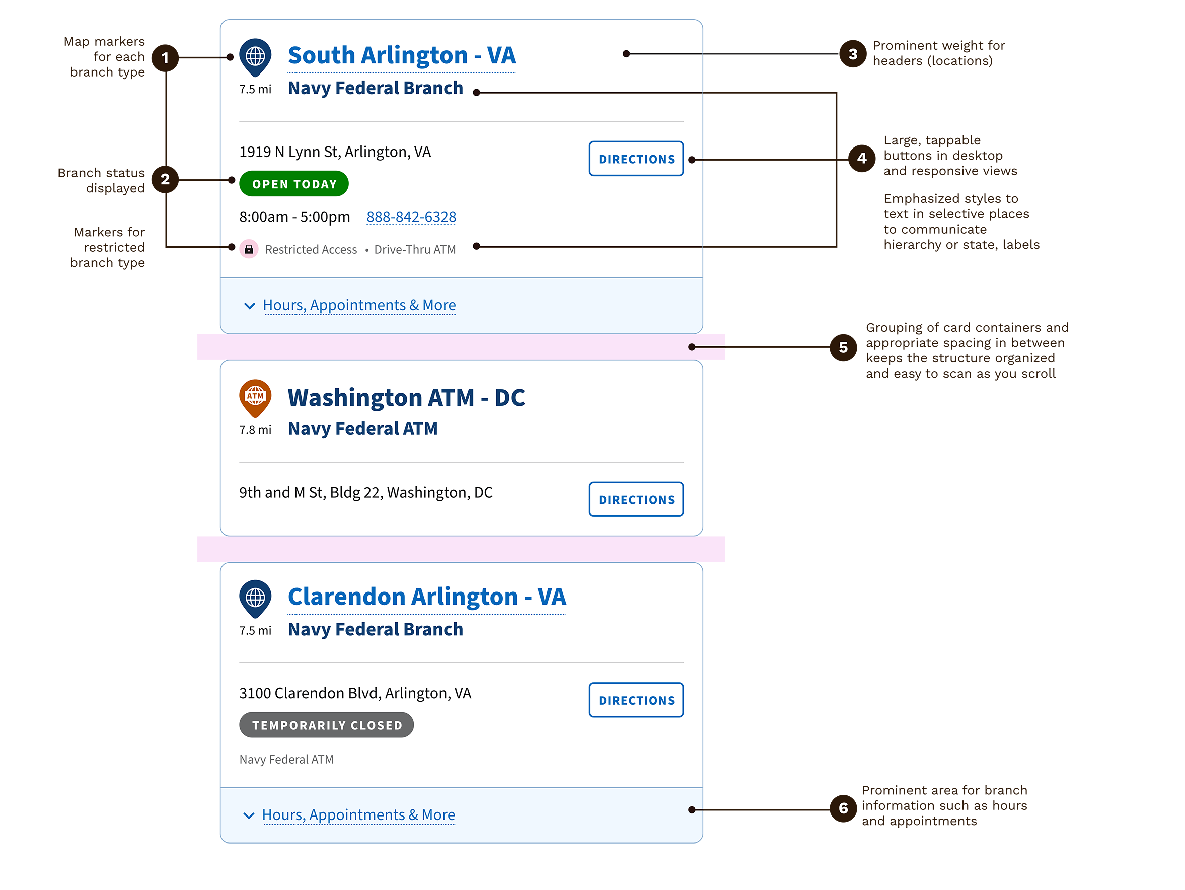
A key part of my role as the visual lead for this project is not just to create and update styles but also to prioritize accessibility and its impact on the overall design. Additionally, the page layout offers more space, creating a more comfortable and breathable environment for the information presented.
“Selecting a color is not as simple as it may seem! We examined possible constraints, especially concerning our color selections for map markers, to ensure they are accessible and easily distinguishable between each type of branch.”
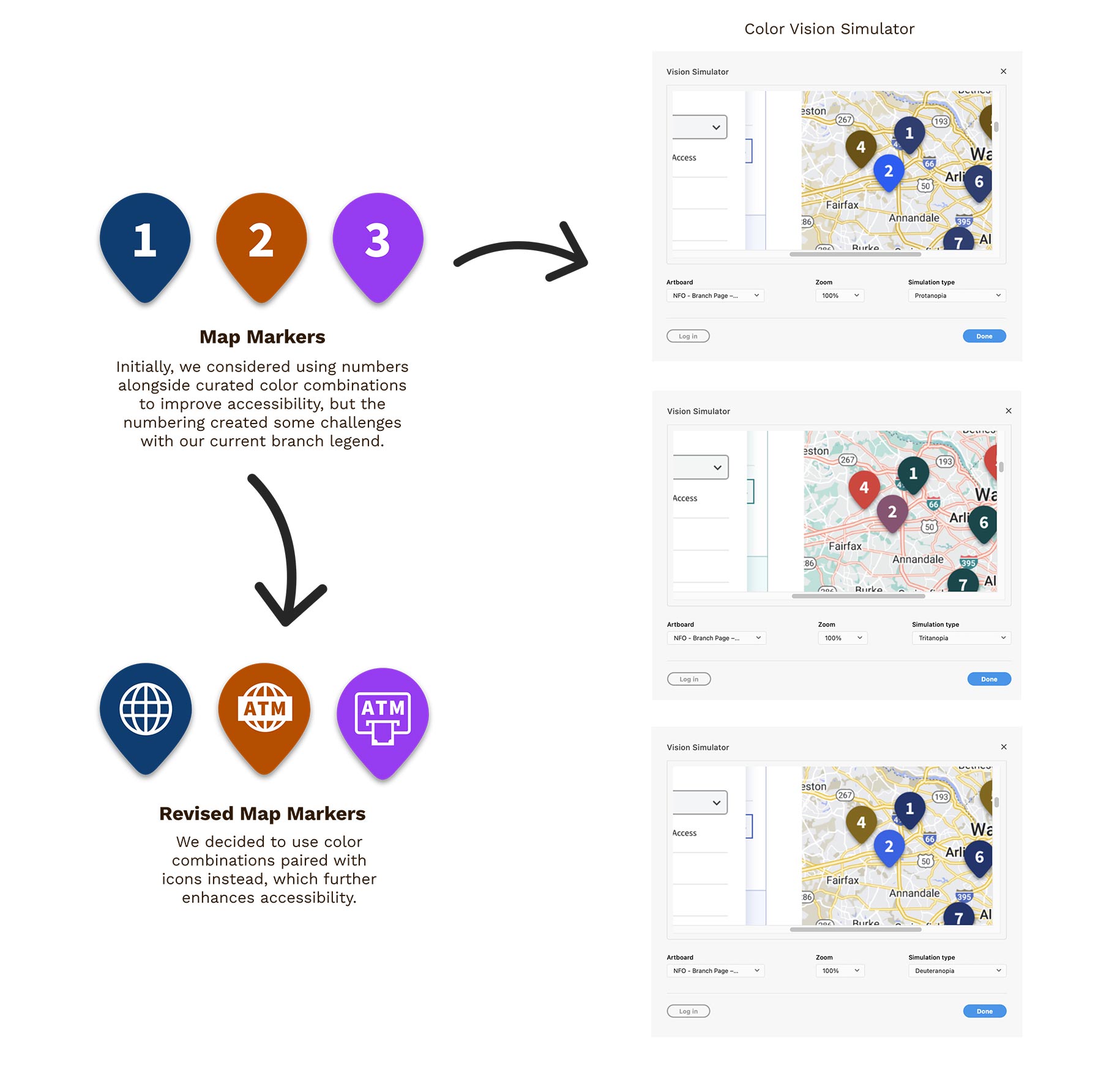
We developed unique icons to ensure that each branch type is easily distinguishable from the others. This approach eliminates reliance on color alone, utilizing carefully selected combinations that provide sufficient contrast. As a result, individuals with color blindness can effectively differentiate between each branch type.
“By defining our UI story and adding accessibility annotations to our Definition of Ready, we cut development time and enhanced team collaboration.”
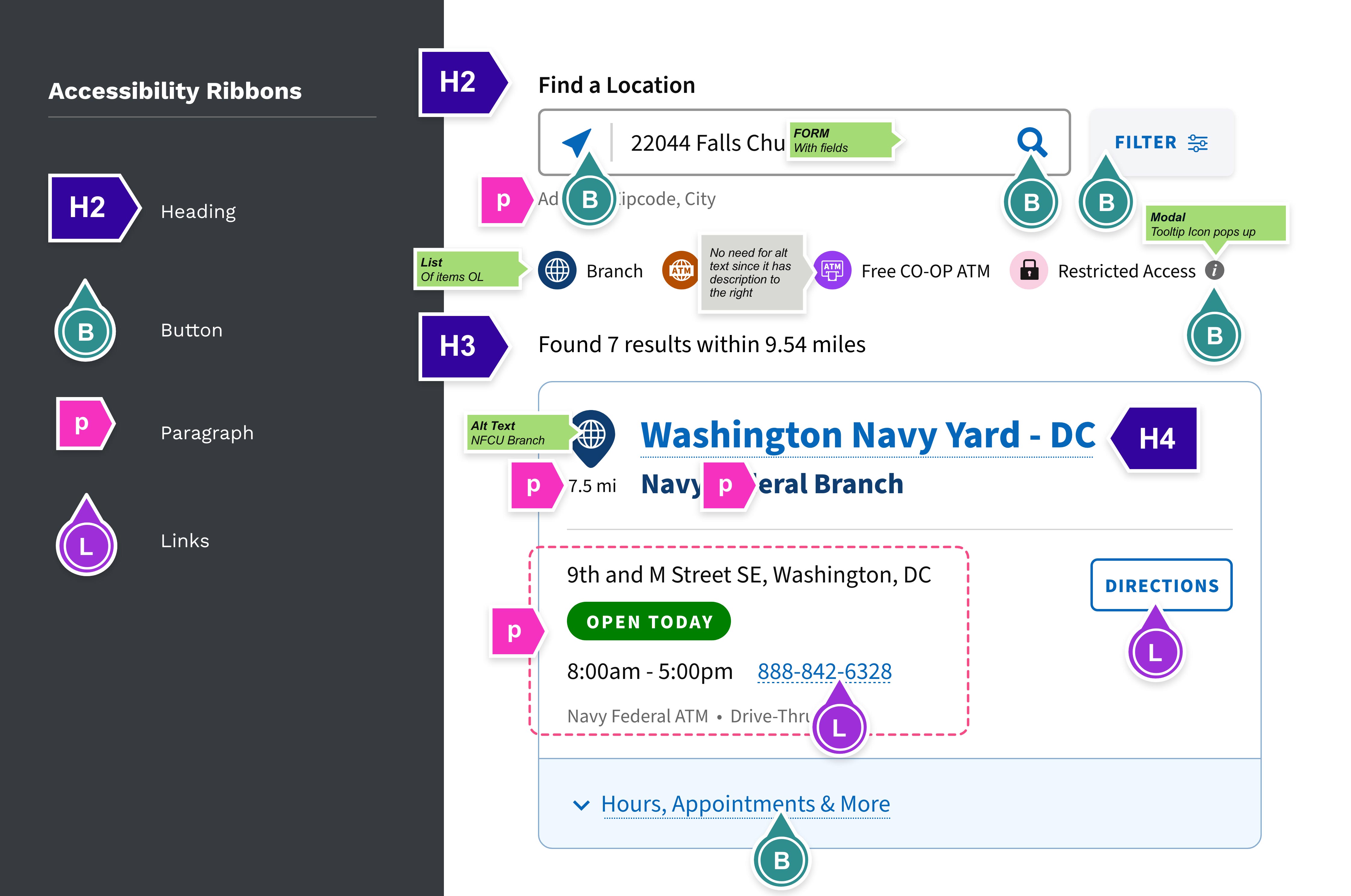
We added accessibility annotations to our Definition of Ready, guiding screen reader behaviors with the dev team, which simplified our research into the acceptance criteria.
Reviewing Our Findings
Testing Again
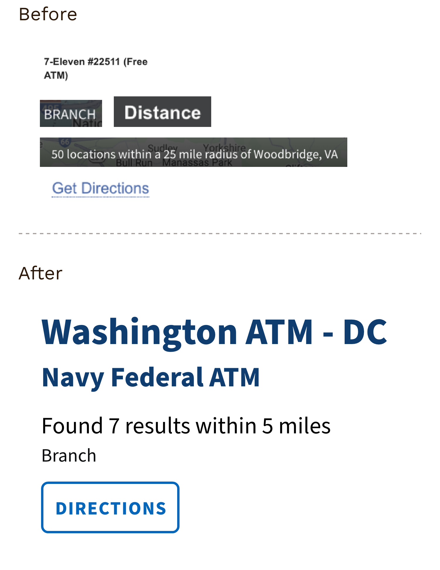
Key Styling ChangesTesting showed that members preferred the map markers in the list view to be clickable, which should dynamically pinpoint the corresponding location on the map to the right.
Visit Navy Federal’s Branch Locator Page!
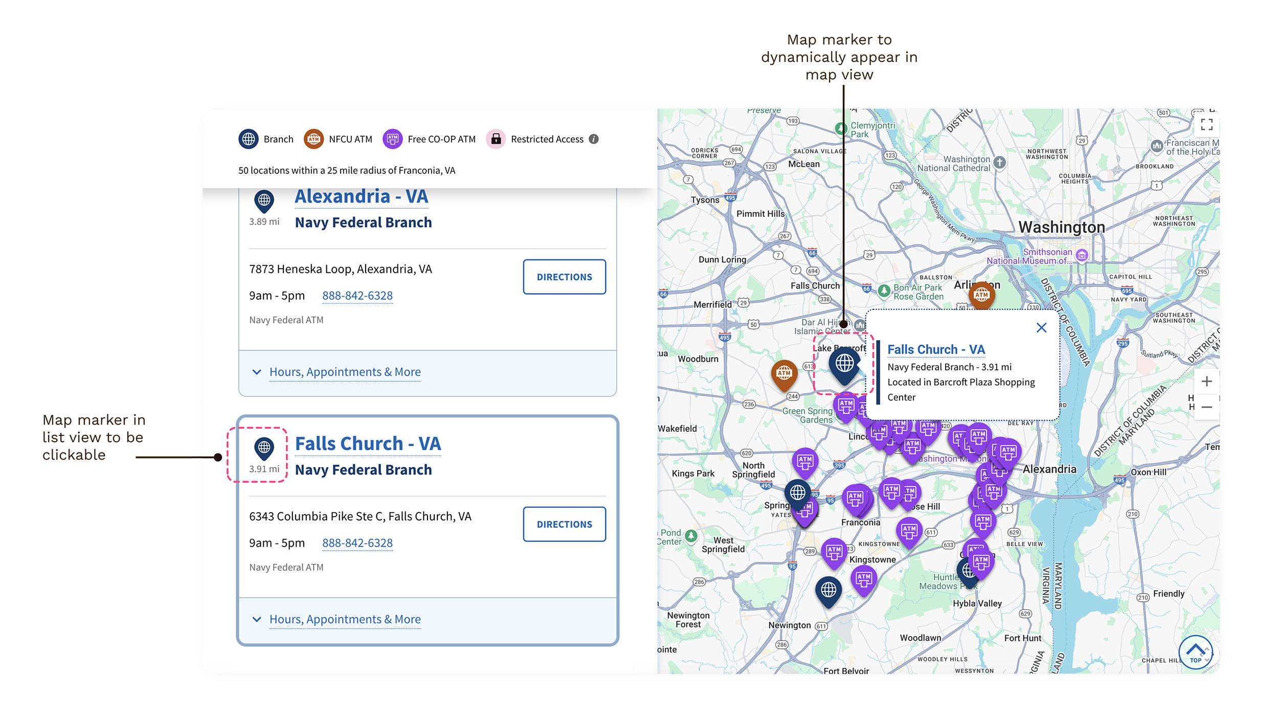
Branch Locator Map Marker Findings
Outcome and Impact
Reflections and What I Learned
By prioritizing accessibility and adding accessibility annotations to our Definition of Ready, we reduced development time and improved collaboration among designers, project owners, and developers.
Project Impact:
-
Clicking on “Book an Appointment” has doubled, and clicks on our “Directions” links have also increased, resulting in a reduction in our support calls.
-
We saved 5-6 hours of development time by implementing behaviors for screen readers because we addressed this early in the design stages.
-
Provided guidance to designers on implementing accessibility annotations, greatly improving the team's understanding of accessibility principles. As a result of my mentorship, my mentee received an accessibility team award for outstanding performance.
Next Case Study
Hey, Mitch! AAC Web App