How a Site Became an Accessibility Hiring Tool
PROJECT: CUPCAKES FOR EVERYONEIncreased digital accessibility awareness among 350+ employees by creating a conceptual website to promote inclusion and hire accessibility engineers.
It’s Not a Problem. It’s an Opportunity.
Leveraging our mentorship program at work, I spearheaded a grassroots initiative with my three colleagues (Sarah, Jasmine, and Marie) called “Cupcakes for Everyone,” a conceptual website built to ensure that all users, regardless of ability, can effectively navigate and interact with a digital product using accessible and semantic code.
Visual Design by me. UX Design by Jasmine Lewis. CSS by Sarah Cho.
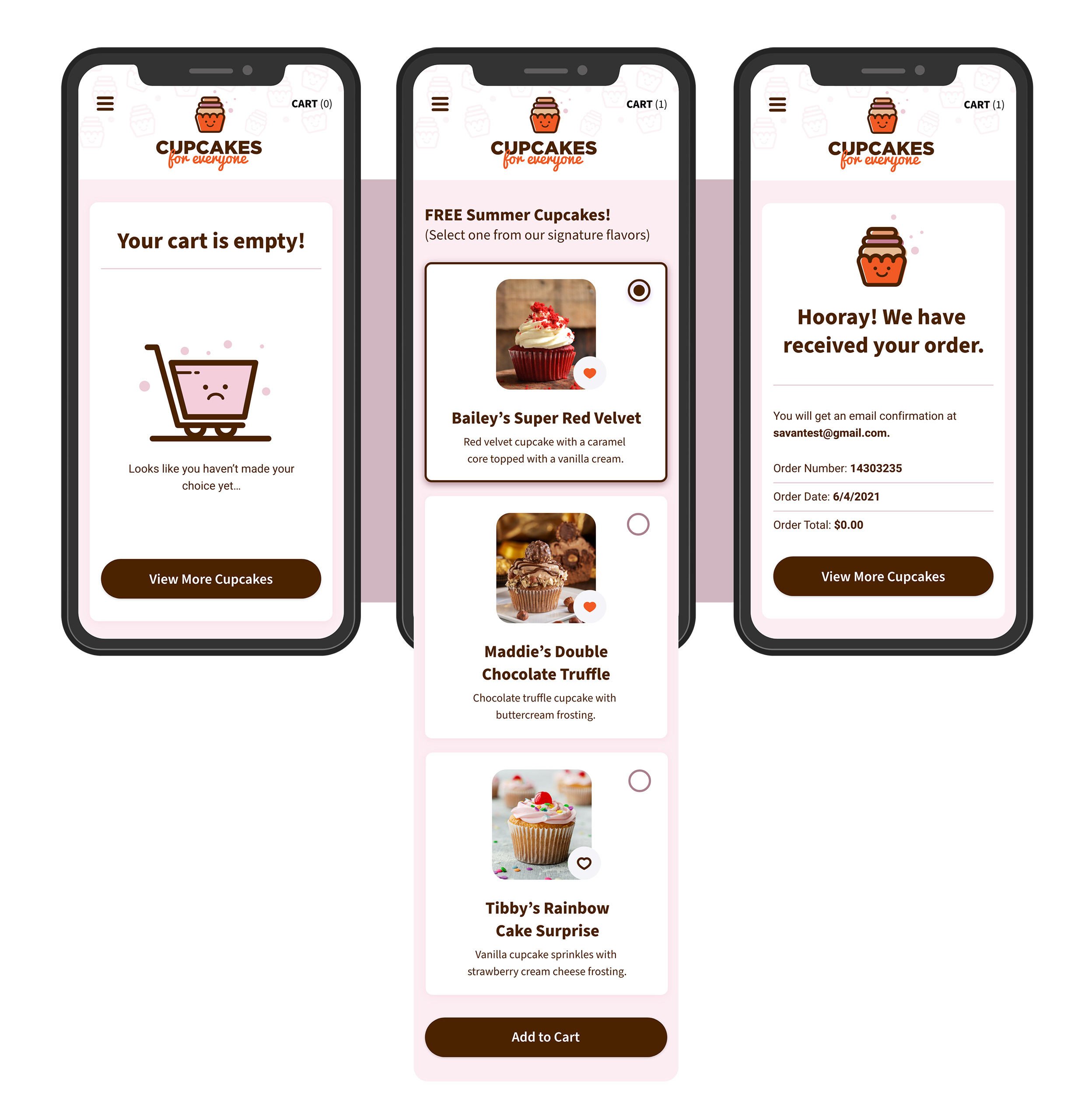
(left) Empty Cart Screen (middle) Main Landing Screen (right) Confirmation Order Screen
Roles and Responsibilities
My Role
Visual Designer and Project Lead
The Team
2 UX Designers, 1 UI Designer, 1 Web Developer, 1 Web Accessibility Specialist
Timeline
August 2023 - October 2023
My Key Contributions
UI Design, Concept Ideation, Accessibility Annotations, VoiceOver Testing
Defining Our Product Vision
Users and Audience
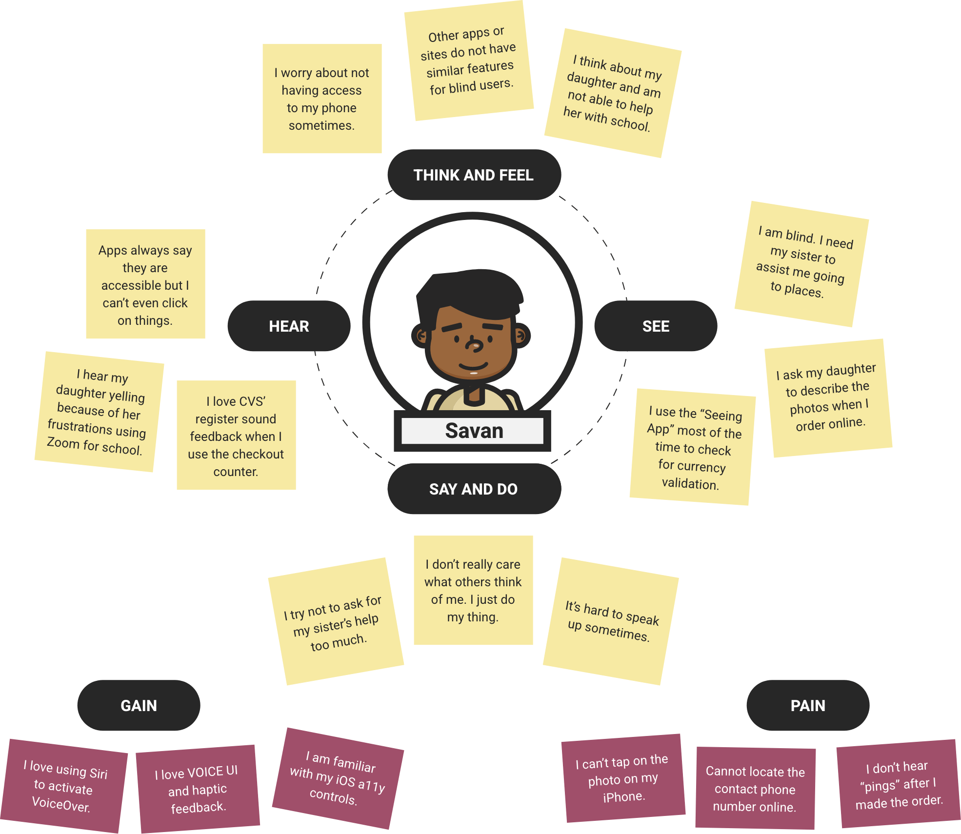
Thinking about our users and who they could be was essential to our project. To bring a different perspective, we facilitated discussions with other teammates, managers, and staff, especially those who were not like us.
I thought about my friend Savan, who has been blind since birth. He is a musician and orders items for his gigs online. I always wondered how he felt whenever he bought from websites that were not accessible.

“I understand, you know? But unfortunately, many websites are not designed for people who are blind or have a visual impairment.” - Savan Ok
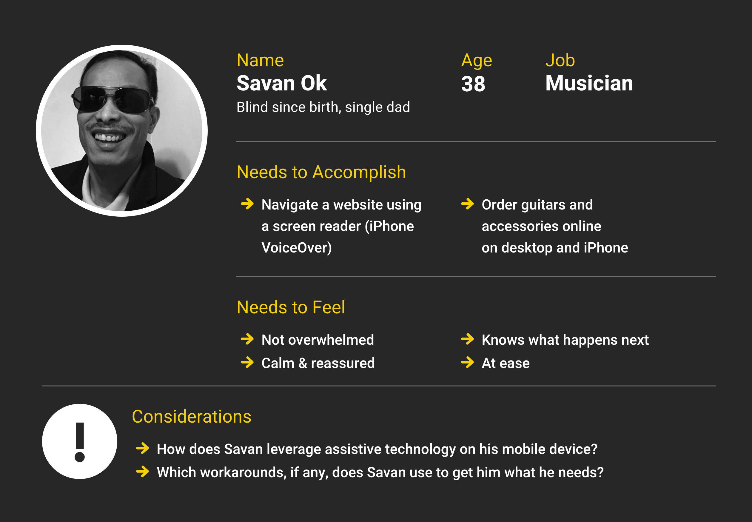
Blind User: My good friend, Savan Ok, Northern Virginia
“Due to the limited diversity of participants, we utilized Microsoft’s persona spectrum exercise to help foster empathy and identify pain points.”
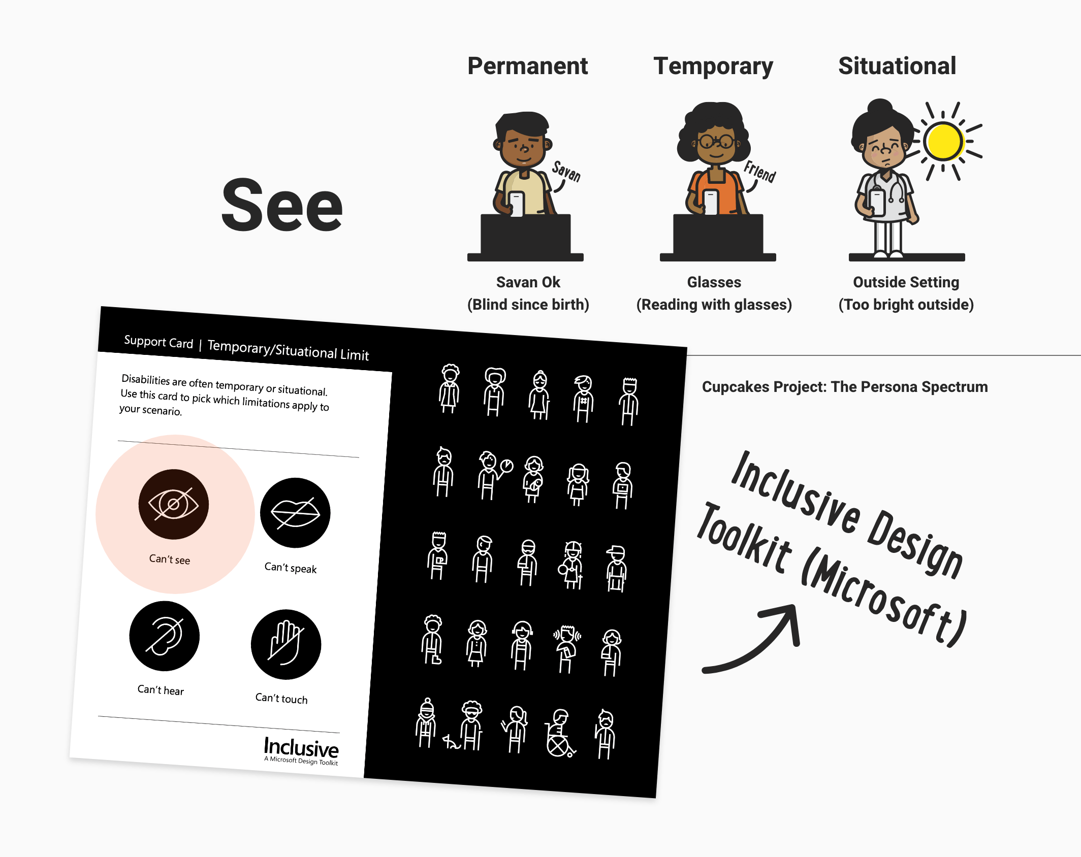
The Inclusive Design Toolkit has been influential in our design process. We used the Persona Spectrum exercise to improve the inclusivity of our process.
Designing for Everybody
The Approach
The goal was to talk to diverse users, including users with disabilities, and include that into the process right from the beginning. For example, based on my research with users using screen readers, many blind or visually impaired users can type fast on the on-screen keyboard, but not all blind users can.
Our team created a quick exercise to identify areas of pain points throughout our customer journey. Even if we only had a one-page site to test, we wanted to fully understand our user's needs when ordering online using screen readers.
Designing With Accessibility in Mind
TEXT-ONLY EXERCISE
Breaking Down the PageThe text-only design exercise helped me communicate the page objectives clearly to our team member, Sarah, who was in charge of developing the page using HTML and CSS. This approach also saved me time, which was beneficial when I tested the site with a screen reader (VoiceOver).
Some challenges I went through during this stage:
- Preparing to test the site using VoiceOver
- Not completing the style guide in time for development
- Developer and visual designer coordination
- Time constraints during UX and visual coordination regarding wires
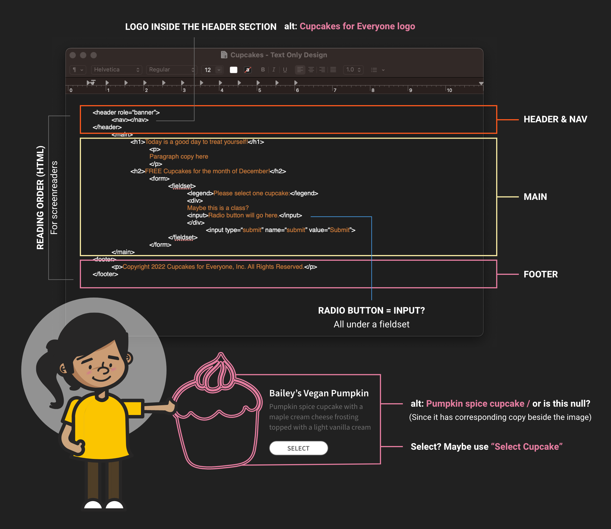
Text-only design exercise in preparation for dev collaboration
“The inclusive persona exercise, empathy map, and text-only design exercise aided the structure of my visual layout and branding.”
Partnered with our UX team member, Jasmine, and leveraged her wires and universal design principles to map the site’s overall structure.
“It's tempting to jump straight to Adobe Illustrator and Adobe XD and start creating the branding elements for this project. However, I still relied on sketching to visualize the design direction based on our research.”
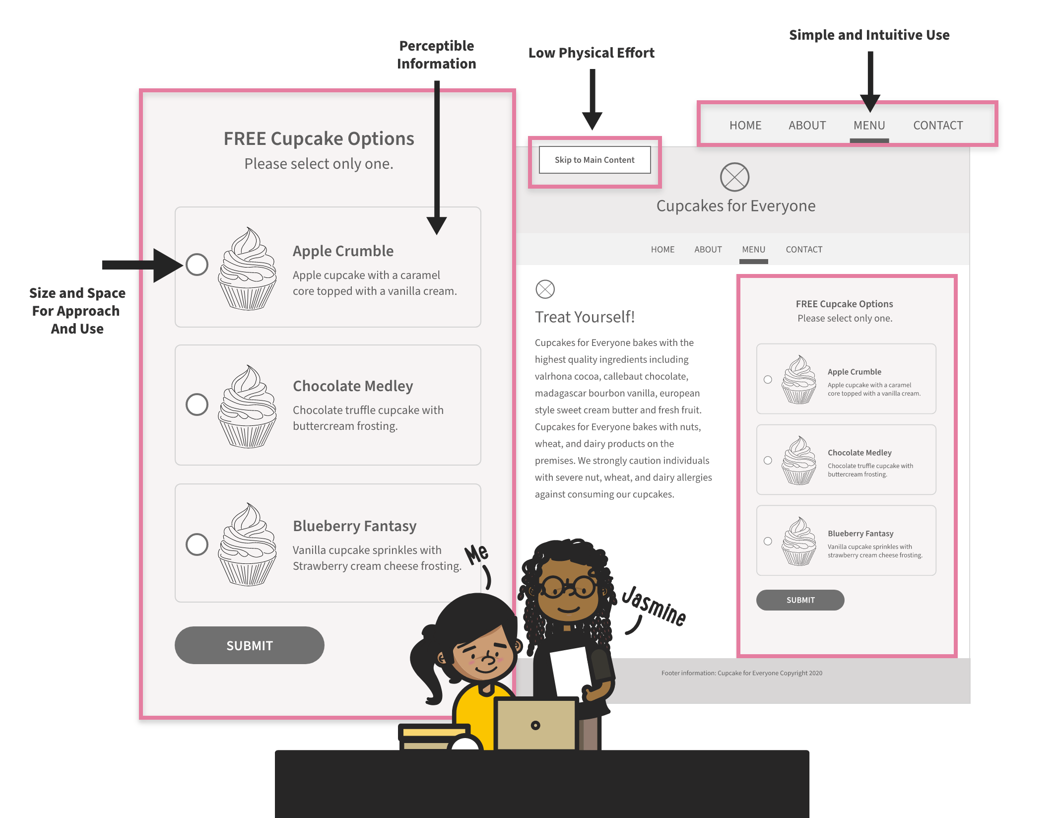
These design principles aided my visual decision‐making process:
- Create a playful brand while maintaining trust
- Provide a layout that is simple and intuitive
- Provide easy-to-navigate action items
- Be mindful of size and space for approach and use
- Ensure that a user can't trap themselves in a corner
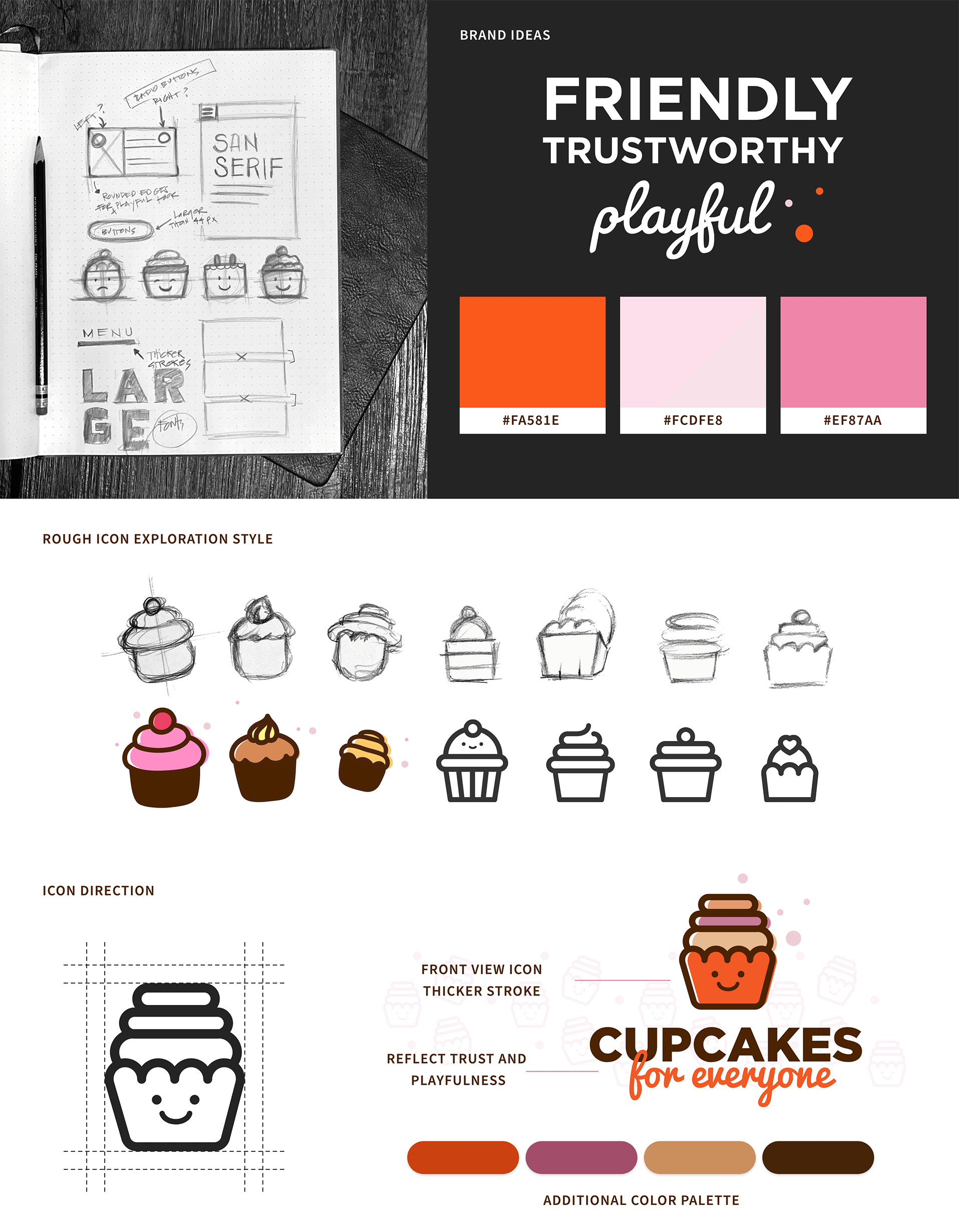
The Cupcakes for Everyone branding visual direction and thought processes based on our research and design principles to capture color, illustration style, and typography choices.
“To promote accessibility in my design work, I included annotations in our styles, which helped me communicate accessibility decisions to other designers and developers.”
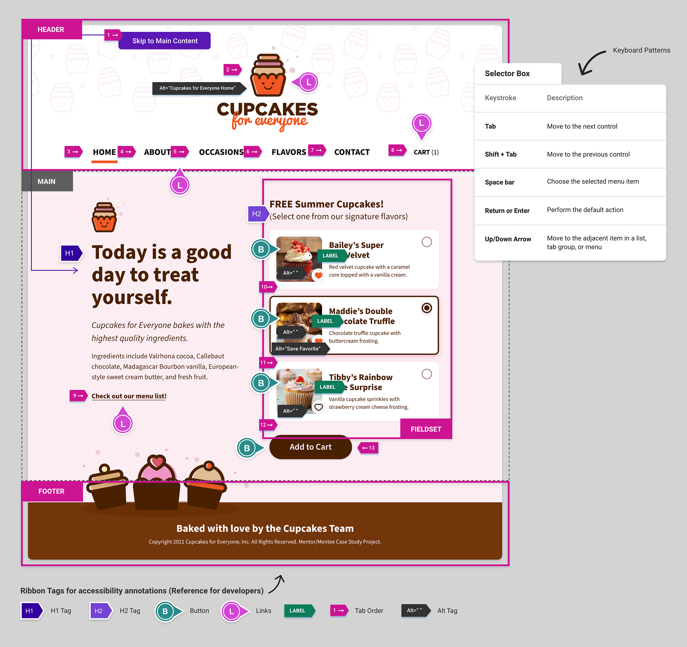
Providing developers with a handy style guide and additional accessibility annotations is essential during design-to-dev collaborations.
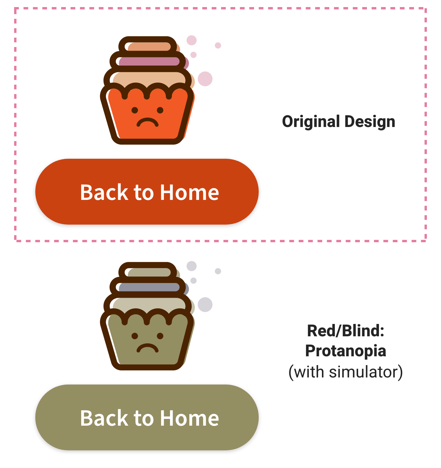
I used the Stark plugin to review our pages and components to simulate colorblindness to test what the site would look like for folks who are colorblind.
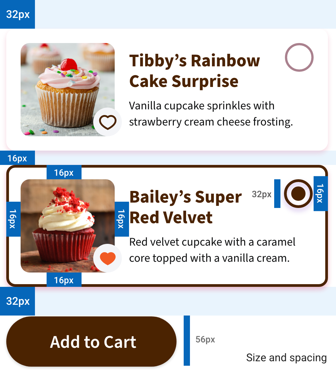
Breaking the cupcake selection information into bite-sized pieces with sufficient white space helped the selection component’s legibility.
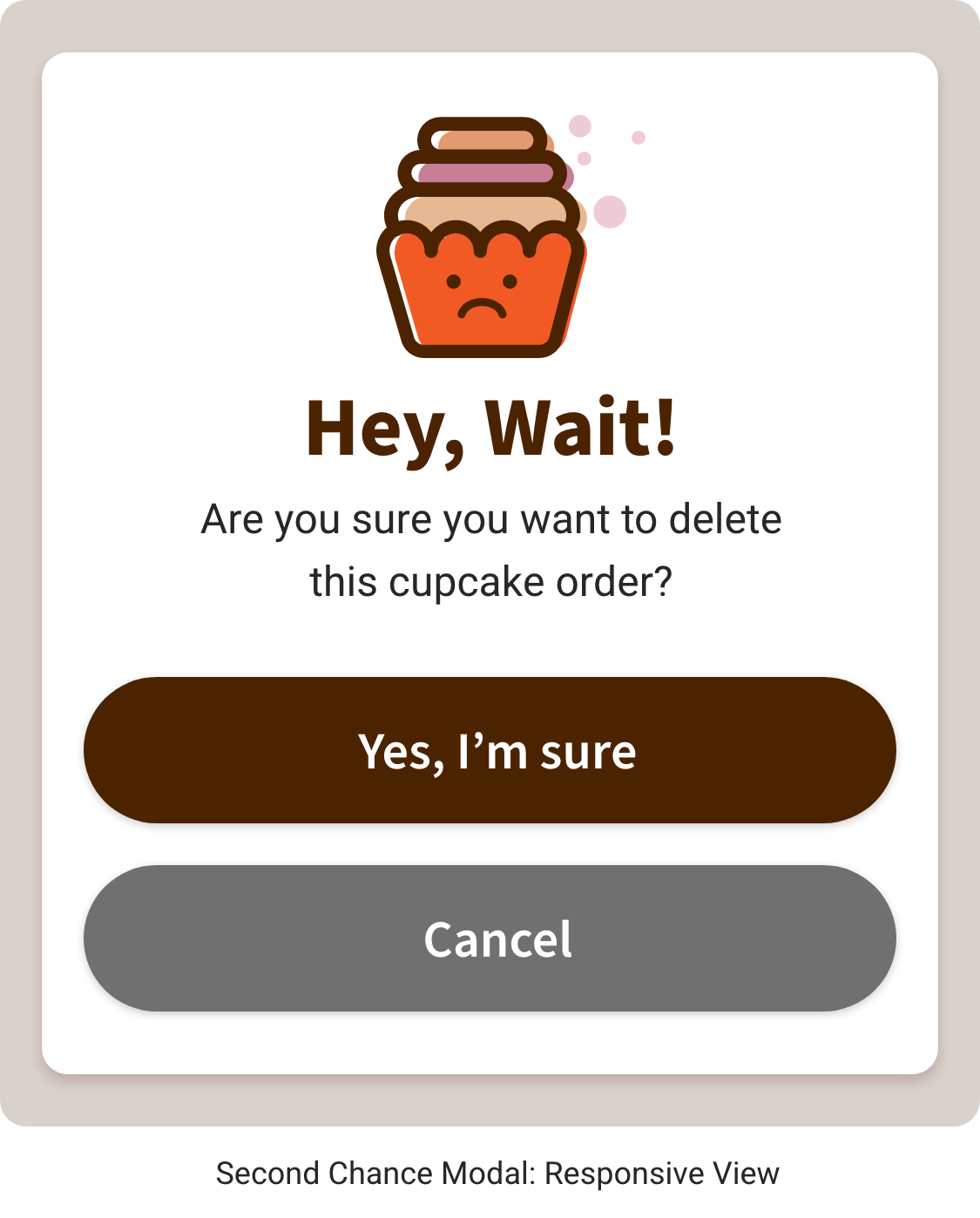
To ensure that users can’t trap themselves in a corner, we added confirmation prompts to account for these inevitabilities.
I considered different hand sizes and dexterity, especially for one-handed mobile device use, making action targets large enough to click or tap easily and putting primary actions within easy reach.
A Thoughtful Approach is Key: Preparing for Accessible and Inclusive Testing
Navigating Accessibility
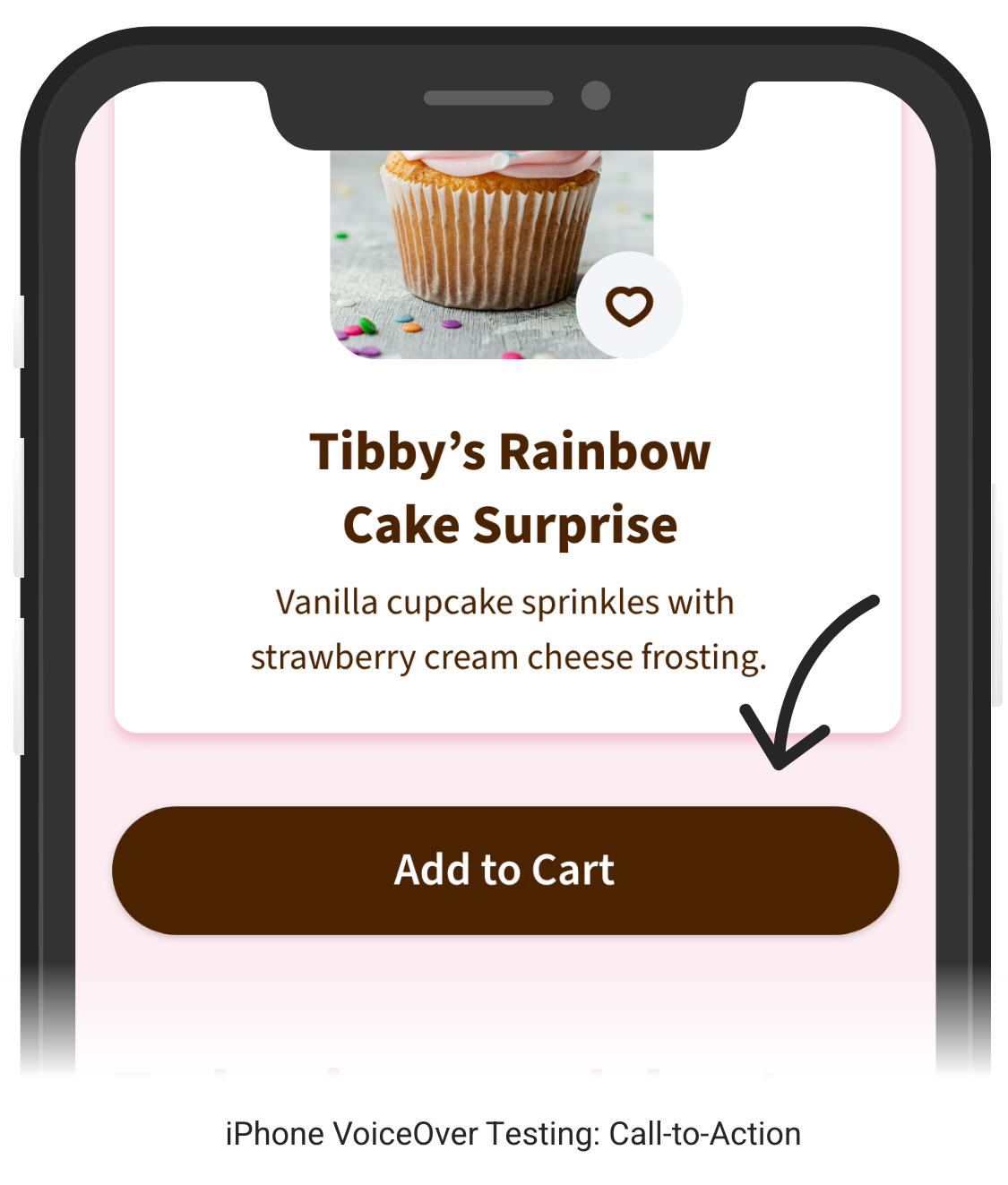
Insights into Screen Reader User ExperiencesSome screen reader users may navigate and consume information at a slower pace. Aligning the button to the left simplifies the choices compared to positioning it on the right.
A few questions we noted for testing:
- Are the buttons clear for low vision users?
- Is left alignment more convenient for keyboard and mobile users?
- What does the right button alignment feel like?
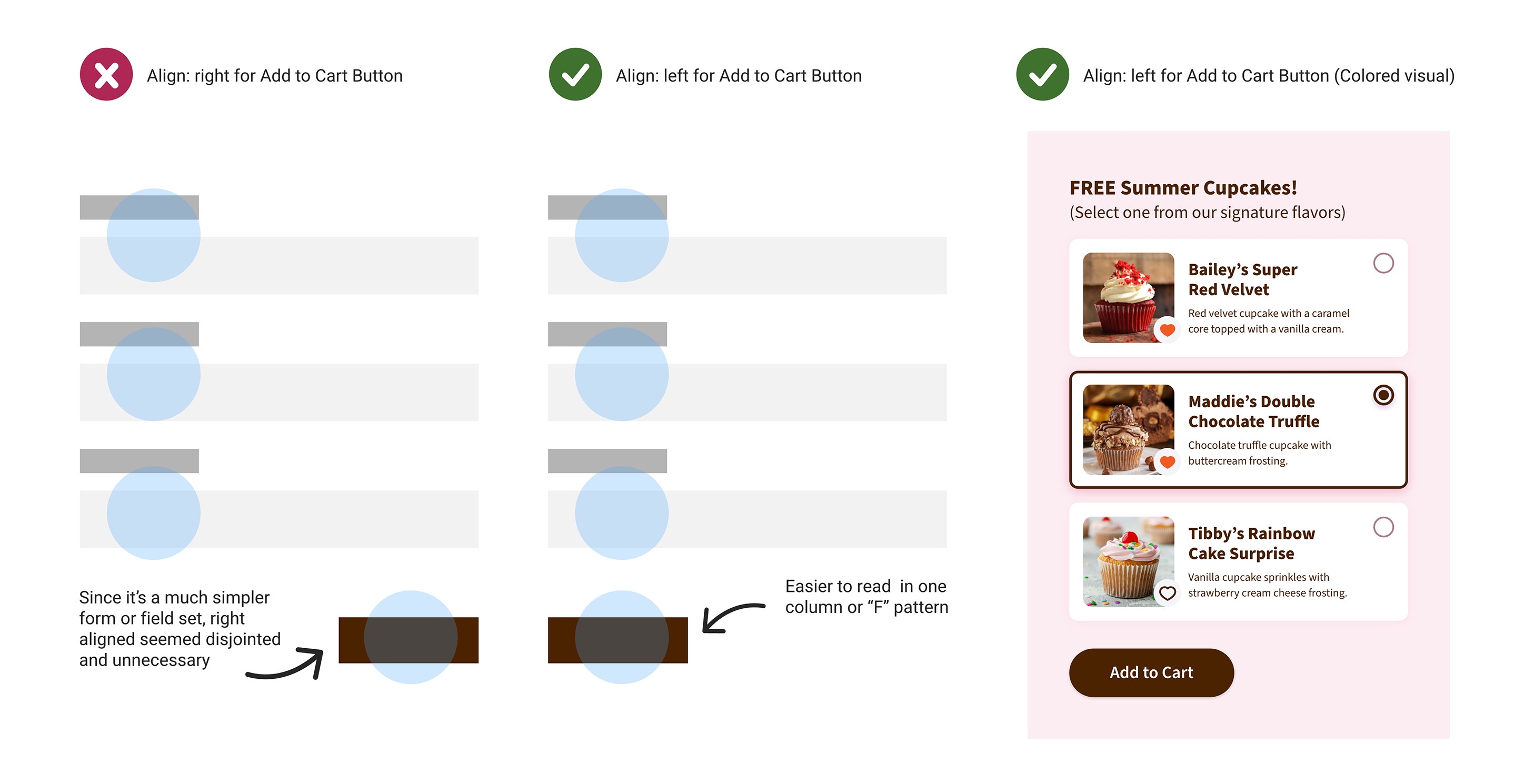
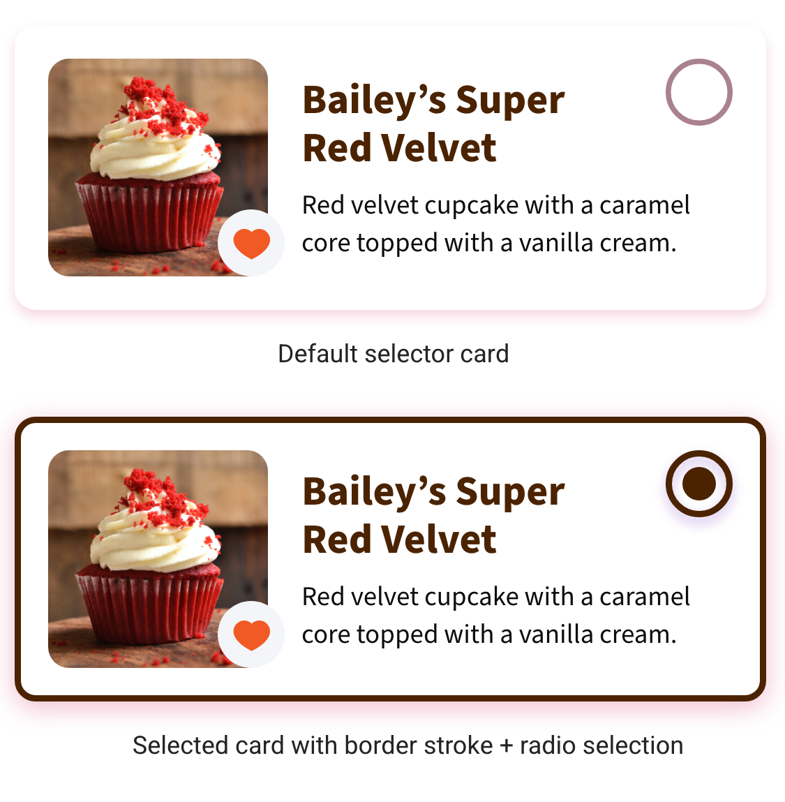
Our low-vision user recommended aligning the layout of buttons to the left instead of the right for easier access when tapping.
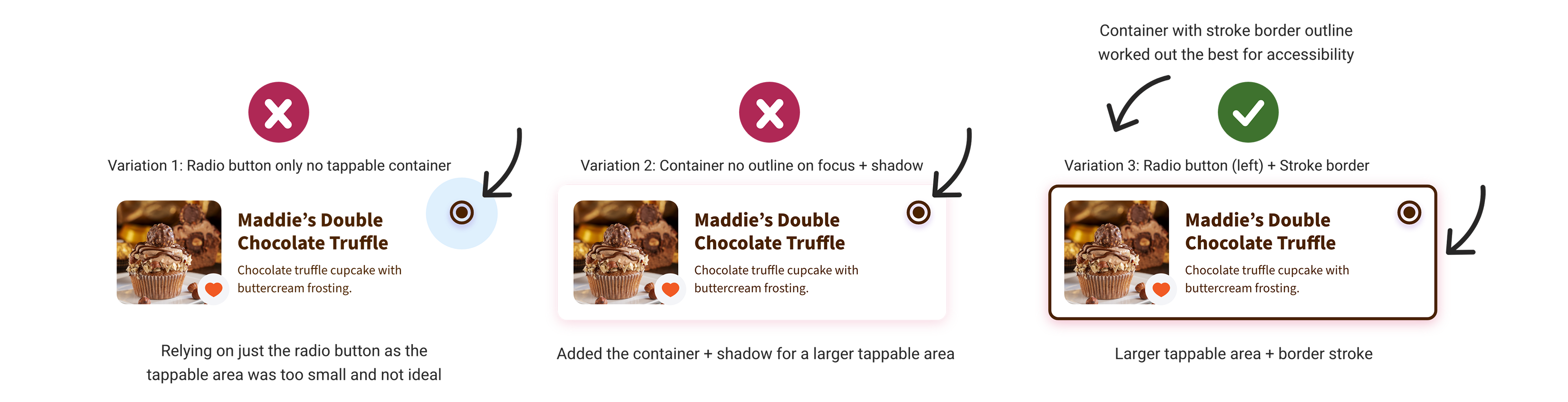
The white container selector component with a border stroke and larger tappable area had a more significant impact on the overall look and feel based on our accessibility testing.
Reviewing Our Findings
Testing Again
Challenges and Delays in TroubleshootingGetting Zoom to work while using VoiceOver was challenging due to the numerous pop-ups. I assumed that our participant already had the Zoom app on his phone, which caused a delay in troubleshooting during testing.
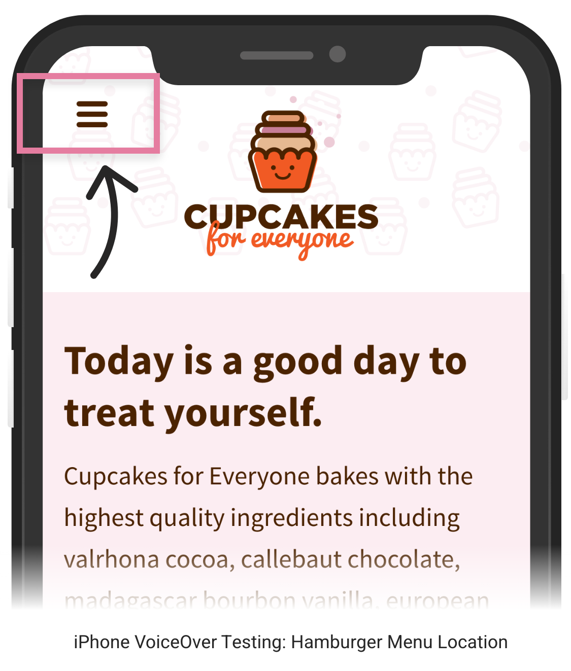
Our blind user couldn’t tap the navigation menu on his iPhone. The CSS markup for the responsive navigation menu was incorrect, so VoiceOver did not capture those links during the interview.
After selecting a cupcake, our blind user missed the toast notification announced by the screen reader that an error message occurred when his order was incomplete.
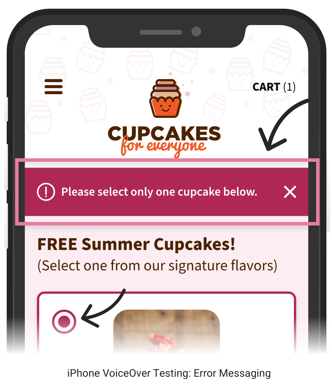
Our blind user successfully located the “submit” button but wished some screen reader announcements were more descriptive.
Outcome and Impact
Reflections and What I Learned
The Cupcakes for Everyone CSS template now serves as a valuable learning tool for new developers joining our organization, helping them understand digital accessibility and inclusion. Our Cupcakes team has grown to a total of eight members, and we have extended our mentorship program to include additional pages on the site.
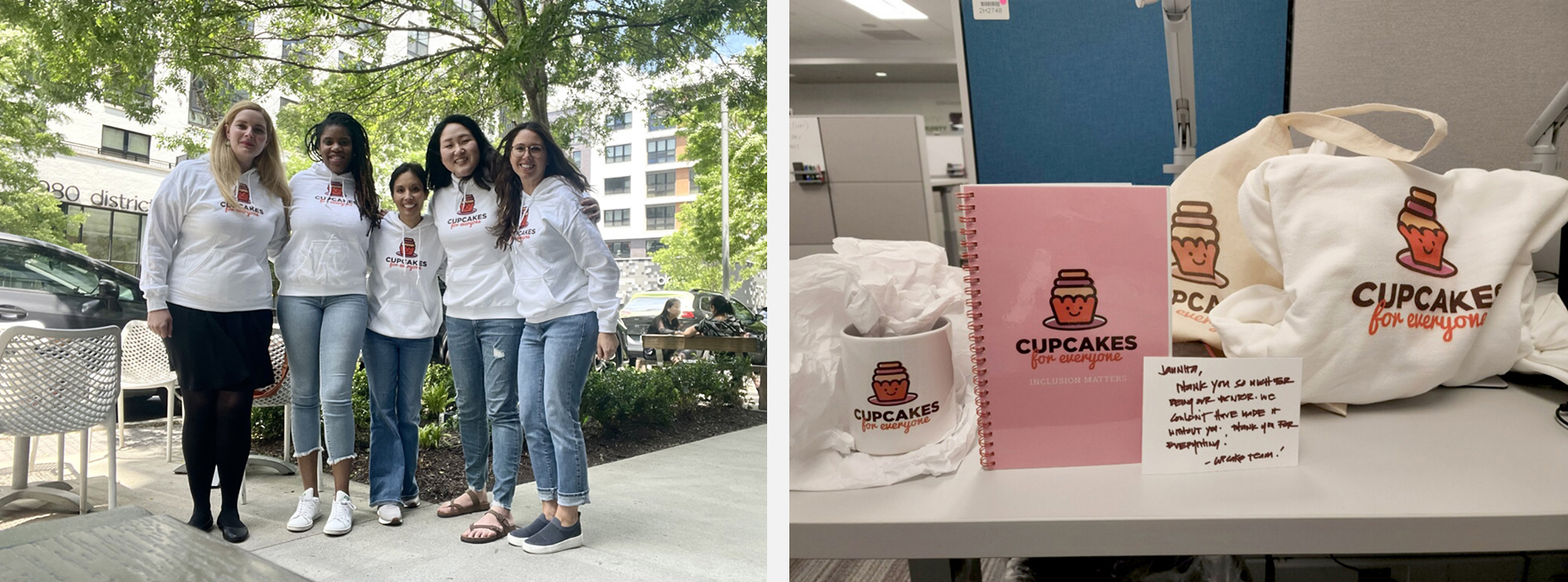
Cupcakes for Everyone Team (from left to right): Jaunita, Jasmine, Michelle, Sarah, Marie
Project Impact:
-
After presenting our Cupcakes for Everyone research, five other UX team members expressed interest in conducting more case studies on accessibility to advocate for inclusion.
-
I had the privilege of being a guest speaker at Navy Federal's Community of Practice event, which drew more than 200 attendees from across the organization. During my presentation, I discussed the work we've done for Cupcakes for Everyone and emphasized the importance of accessibility and inclusion in our designs.
Next Case Study
Sukii (soo-kee)