Real Estate Investors, Construction Companies, Building Realtors
User Interface Design, Wireframing, CSS
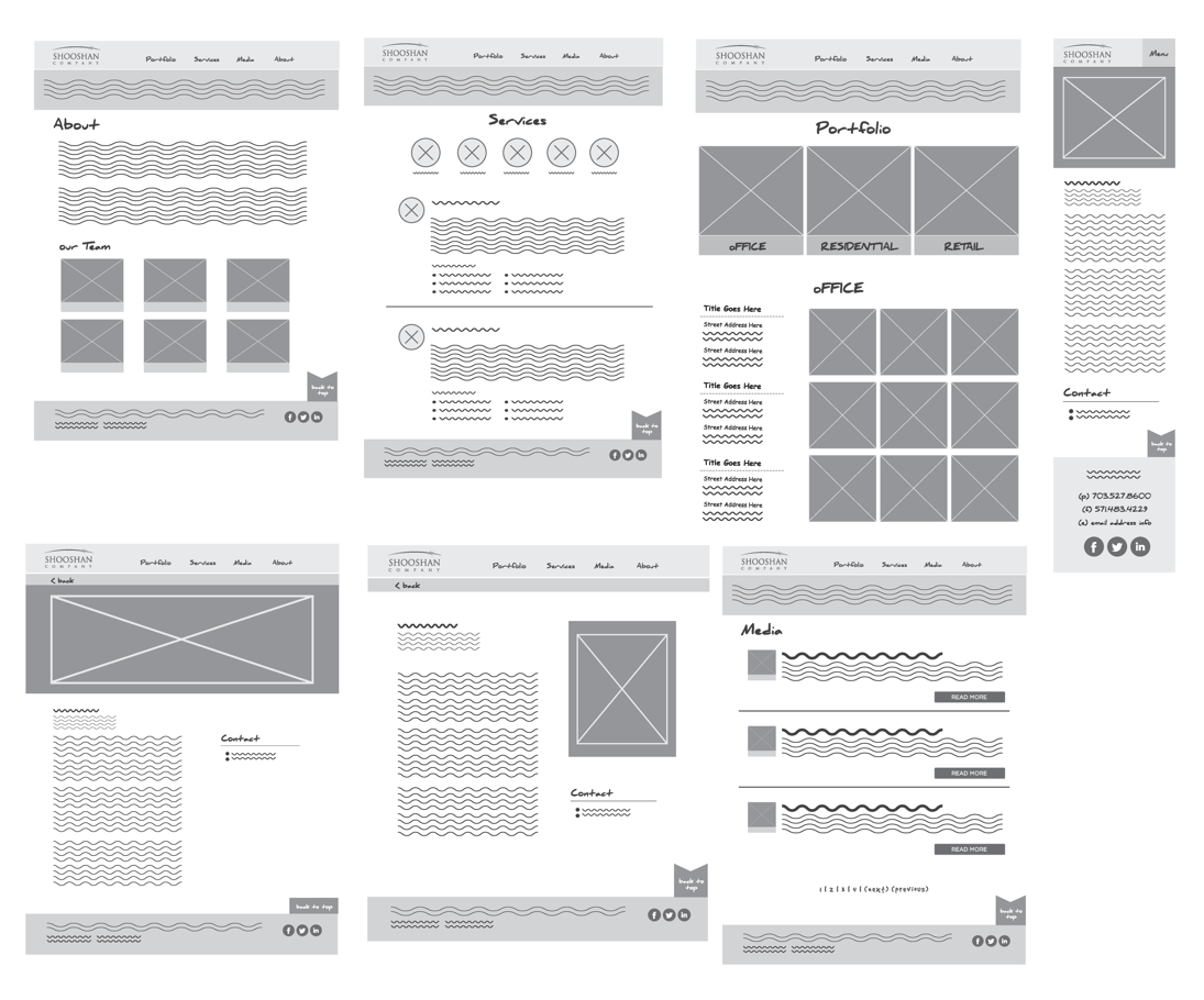
After walking through the wireframes and flow with my Creative Director and client, I worked to get the code in place as soon as possible. I chose to prototype the designs in CSS for quicker iterations and also to expedite the hand-off to our developers to use as a guide for WordPress implementation.
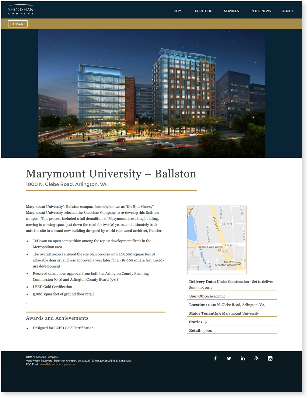
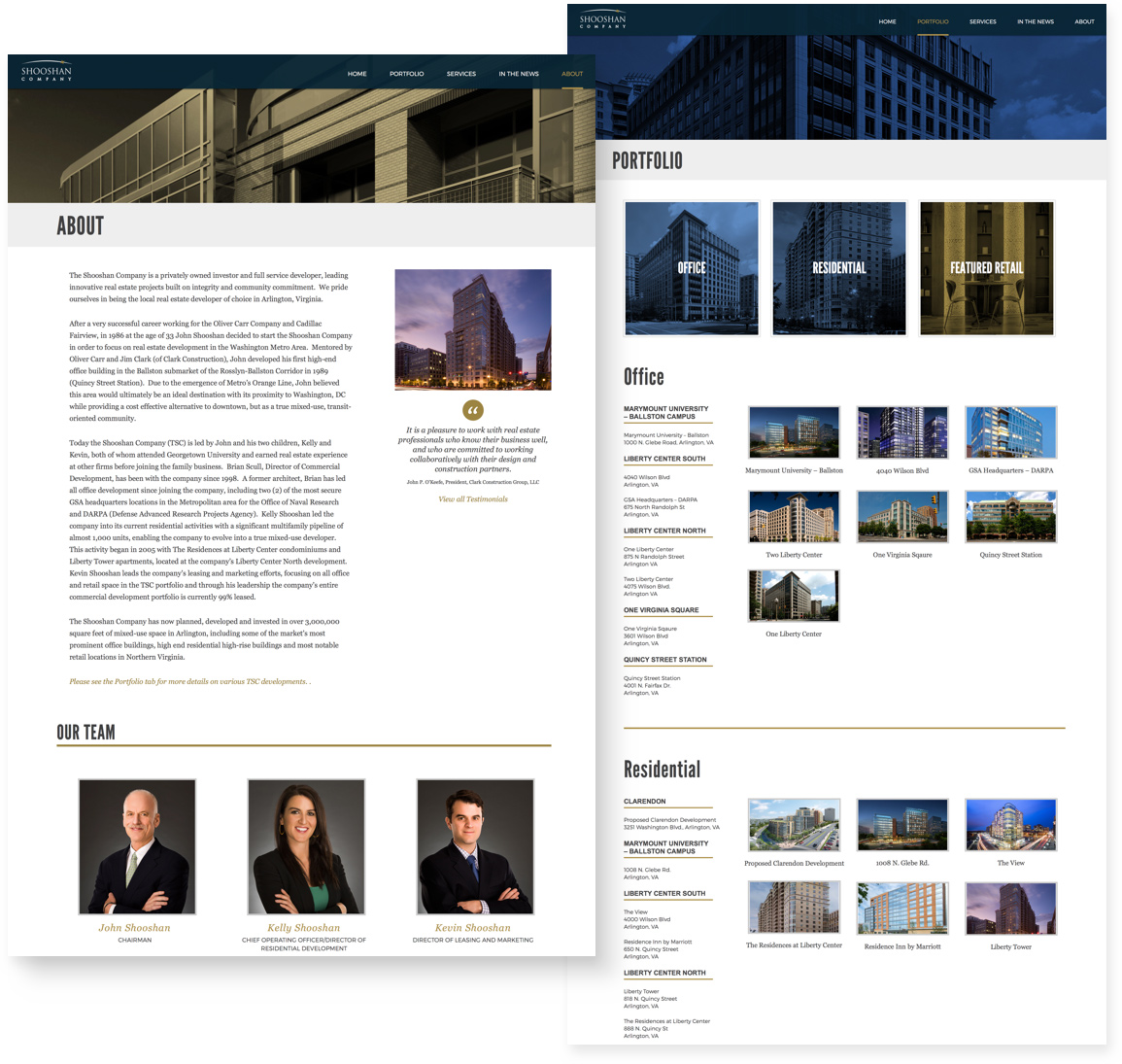
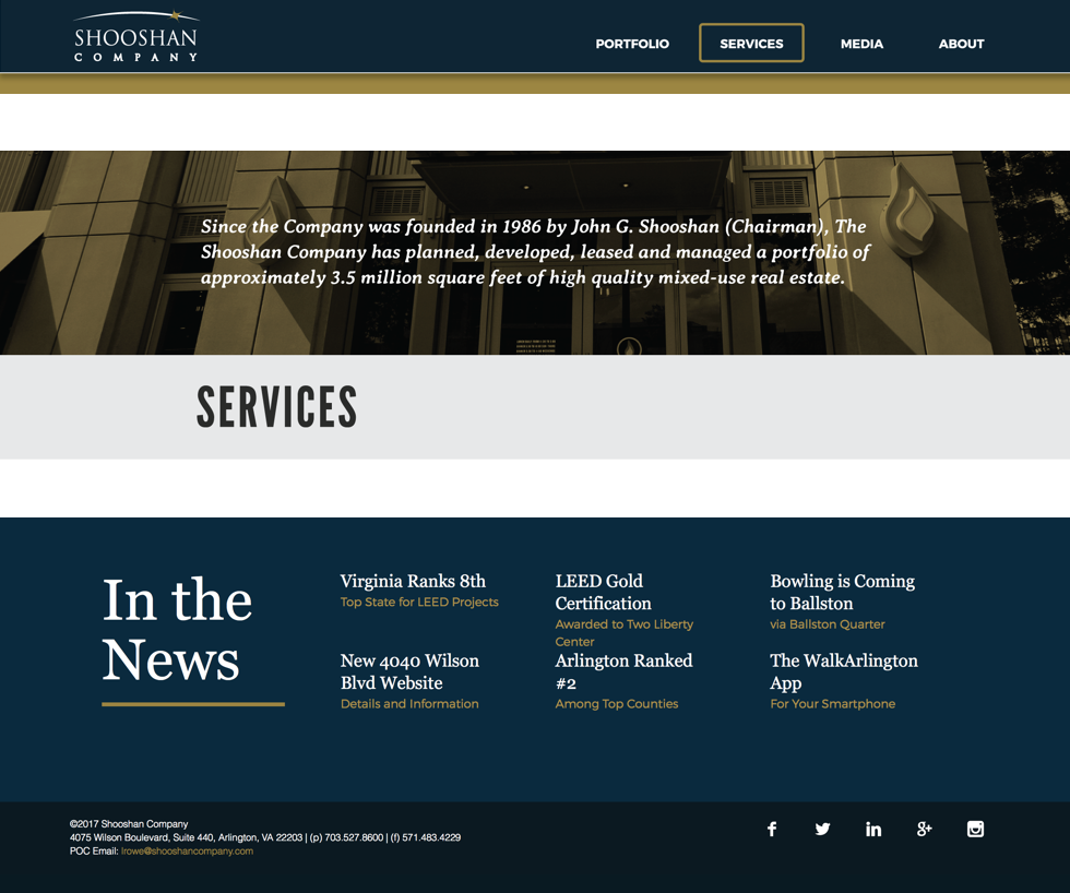
I used Shooshan’s existing branding colors and pulled out some of the gold to use as accents such as text links and underlines.

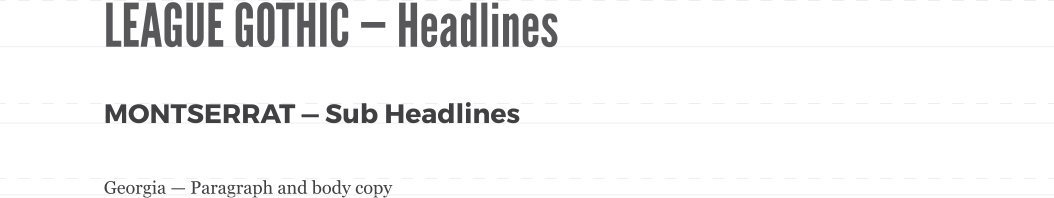
The client was open to changing their typography so we decided to use League Gothic for all headlines paired with Merriweather to be the base fonts. We ultimately used Georgia for the paragraph text per the client’s request.
After finalizing the wireframes and flow with my Creative Director, I created the CSS for each web component and broke down each page into fundamental building blocks. I worked alongside our development team regarding the styling before handing off the final CSS to help them build the WordPress theme.
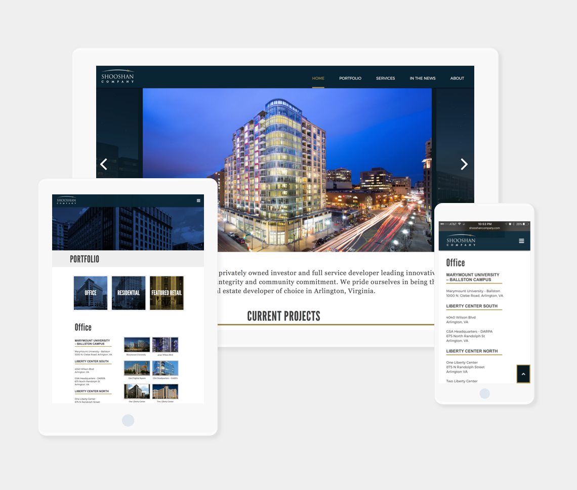
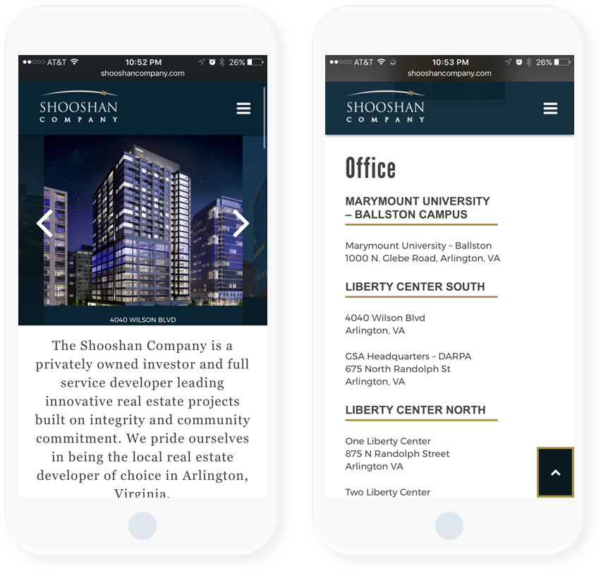
One of the biggest challenges we faced was the homepage photo slider. The client wanted every photo uploaded in the WordPress backend to be centered in the screen regardless of the photo width. This was especially challenging when adding photos that are smaller in width, but our development team was able to tweak the CSS to fix the issue.
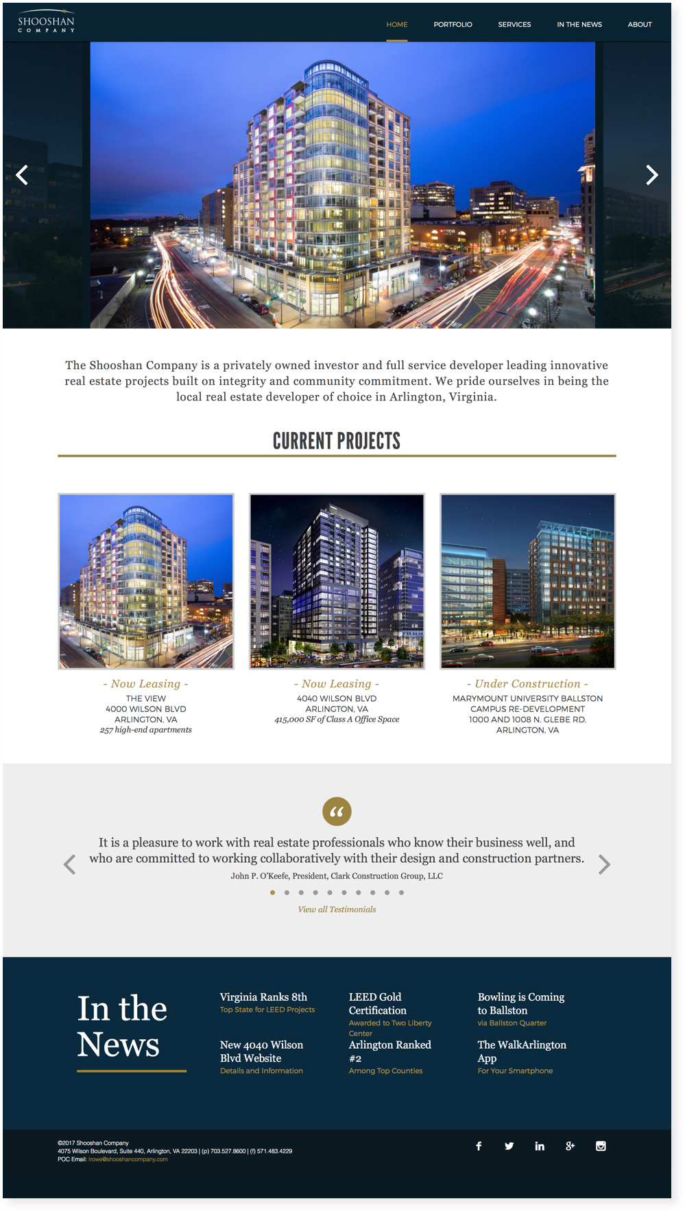
After completing the CSS styles for the homepage, I was able to create the remaining inner pages easily and hand-off to our developer to use as a guide/reference for WordPress implementation. The Shooshan Company’s website was named one of the Top 100 Commercial Real Estate Company websites on Joe Stampone’s blog A Student of the Real Estate Game.