Caregivers, Family Caregivers, Health Care Employees
Visual Design, Illustration, Wireframing (Pen/Paper), Branding
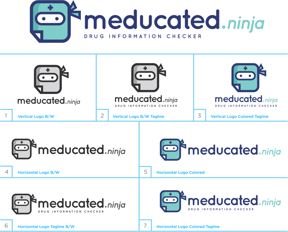
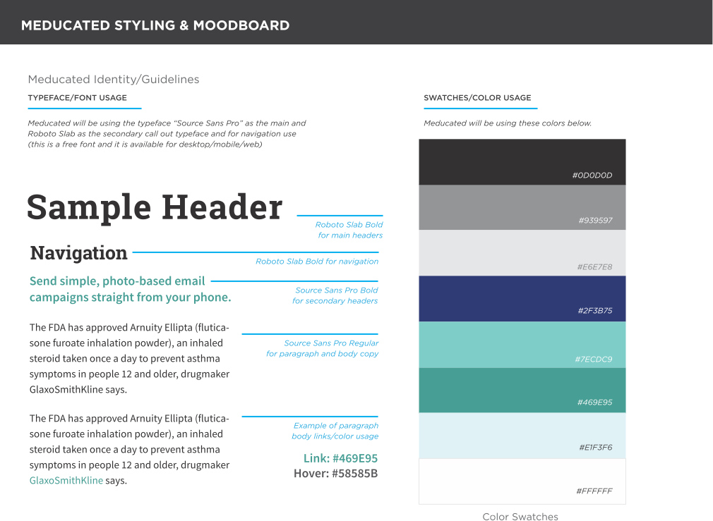
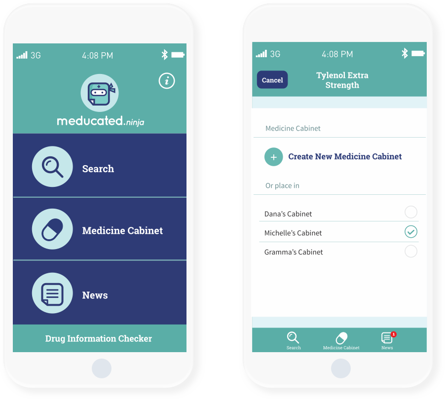
We started the project by brainstorming a name that was related to medication and education and would tie them together. We ultimately decided on Meducated, and to go with a friendly approach/look and feel. My role was to create the visual identity and user interface for Meducated. Our team put together a full experience, including UX/UI for a responsive website, and mobile app design for iOS and Android.
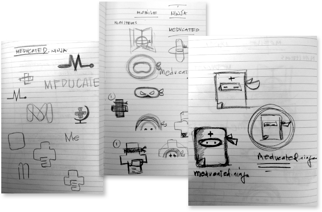
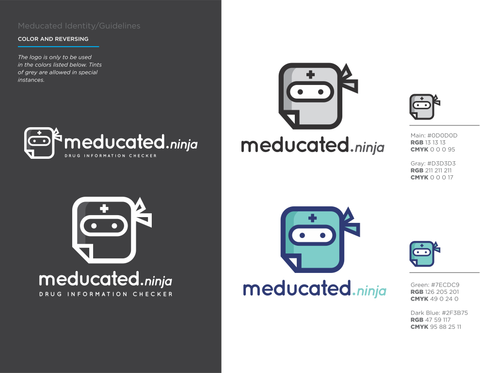
The team decided to take a playful approach with Meducated, and we came up with the “ninja” concept for the brand. I had a lot of fun creating the Meducated Ninja and finalized the vector graphics using Adobe Illustrator.
Our User Experience Designer created quick low-fidelity wireframes and we worked together to create the app userflow. This enabled the developers to start implementing the flow and building out the experience while I was refining the visual designs.
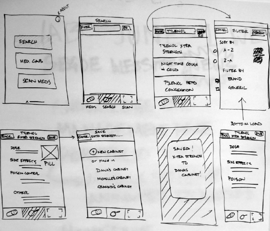
After my team agreed on the wireframes and flow, I created the visual layout and design of the mobile app and worked with our User Experience Designer on the rest of the screen layouts.
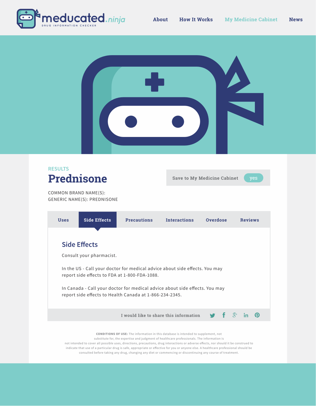
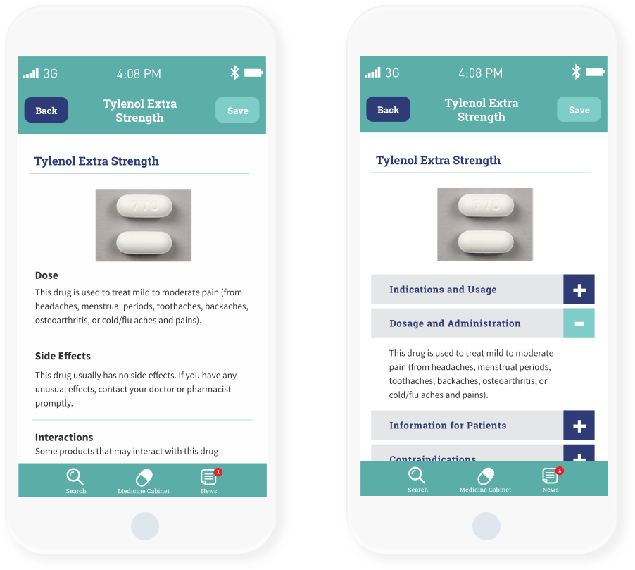
User feedback indicated dissatisfaction with the amount of scrolling needed to review medication information. Our solution was to use an accordion menu to display all the drug/medication information to save space and manage the large amount of content through dynamic switching with a sliding menu effect.
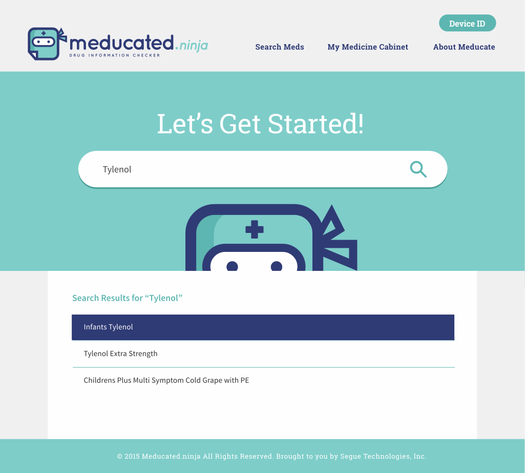
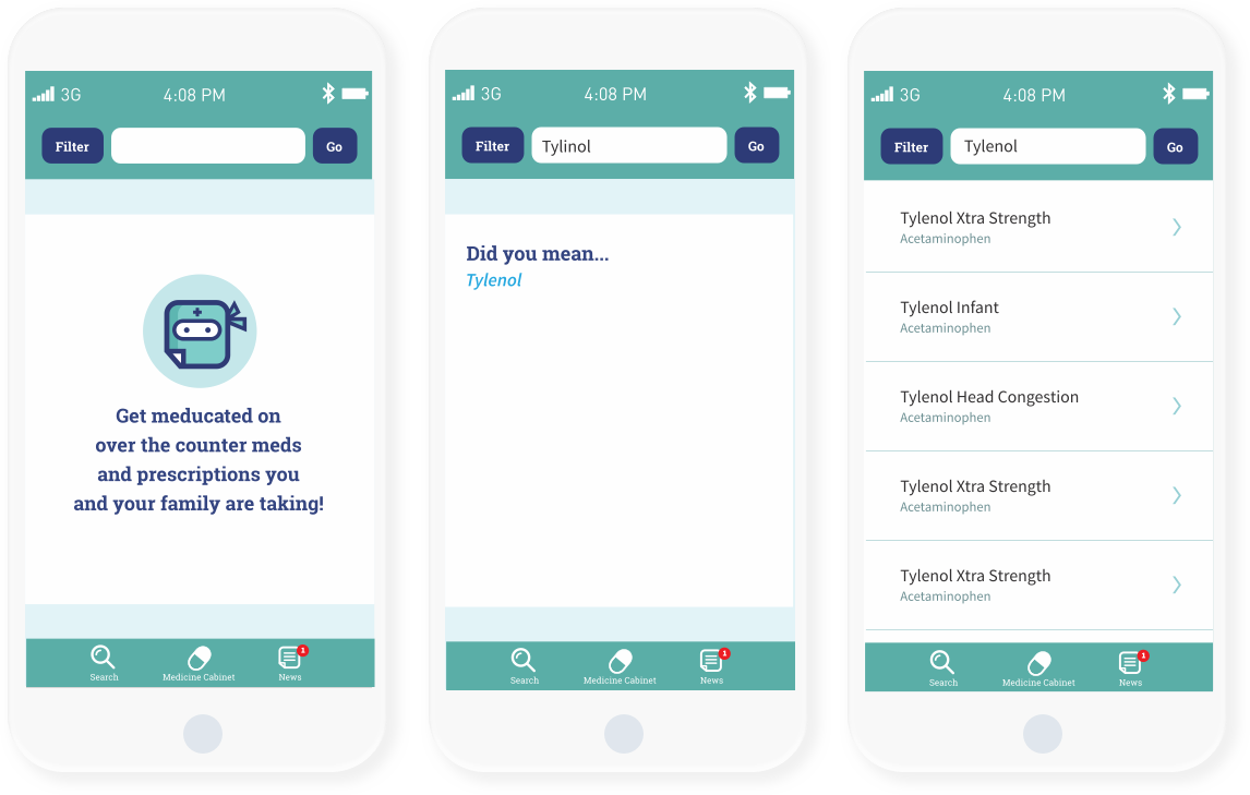
User feedback indicated a need to provide additional medication listings because users frequently did not know the exact spelling of the medicines they were searching for. Our solution was to provide search suggestions for common misspellings.
This was the first exercise challenge we collaborated on at Segue Technologies. The team members for this exercise consisted of: A Senior iOS and Android developer, Senior Graphic Designer, User Experience Designer, Project Manager and Senior Developer. It was refreshing to challenge ourselves and benefit from each other’s knowledge and expertise to complete a project within a 2-week span. From UX to UI to working with the development team on mobile layouts and functionalities, I was able to understand how each team member worked. It was a great exercise and a highly collaborative experience.