Government, Commercial, Non-Profit Clients
Visual Design, Illustration, Wireframing (Axure and Pen/Paper), UI Layout in Sketch, Branding, CSS
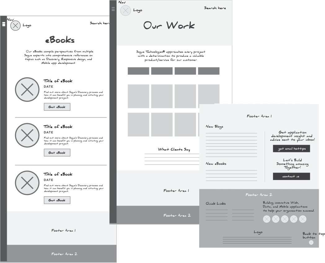
After a series of user testing/card sorting and usability research conducted by our UX team, I worked with my Creative Director on low-fidelity wireframes and screen flows in Axure and started off the redesign brainstorming new features and functionalities to add on the site. We also had to take into consideration the site being responsive and how the new features will work with our new structure. Our main goal was to approach the redesign in a more streamlined way and focus on simplicity, content, and performance.
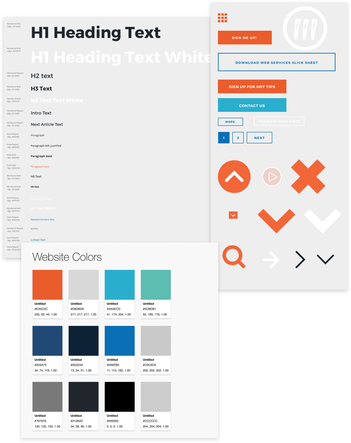
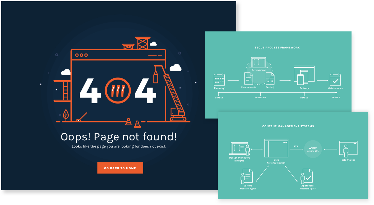
Our solution began with Segue’s brand modifications. This part of the process was actually the most exciting and challenging because I was able to re-explore the Segue brand and propose a more unified visual style. I worked alongside my Creative Director/Usability Specialist to consolidate pages, create a style inventory in Sketch, and tidy up existing graphics throughout the entire site.
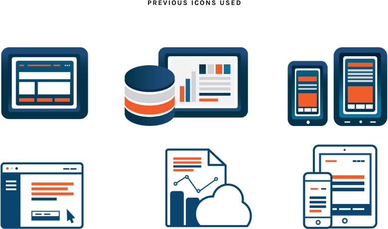
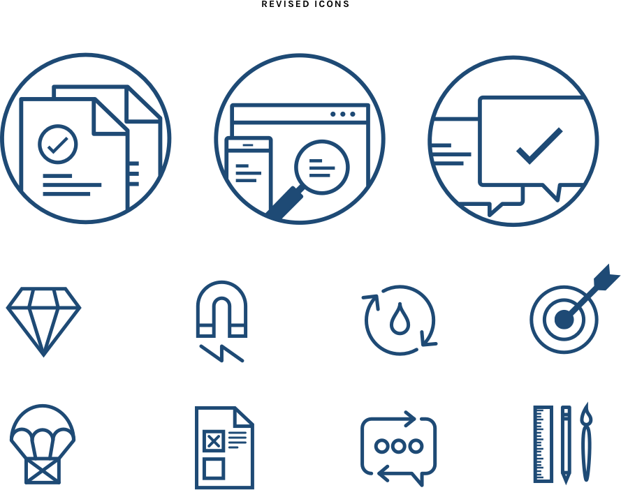
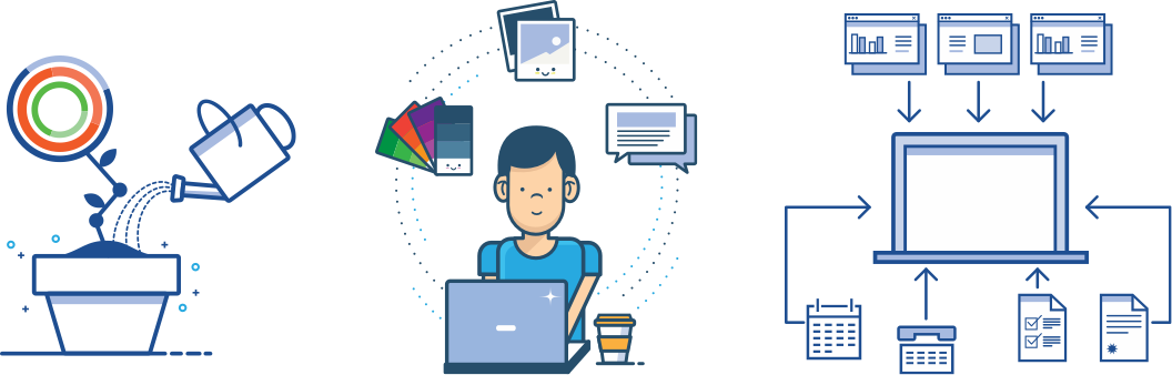
After our team agreed on the flow and low-fidelity wireframes, I started refining the previous illustrations we had on the old site. I noticed that overly detailed icons were tending to clutter up the site. To create a more pleasant visual experience, I created icons that were minimalist in style and yet bold.
The best part about the redesign was creating the small components that would eventually make up the whole interface, and constructing the site in a more methodical way. I worked alongside my Creative Director to break down each page into fundamental building blocks and we worked up from there. We learned this valuable process from Brad Frost’s talk about Atomic Design on An Event Apart.
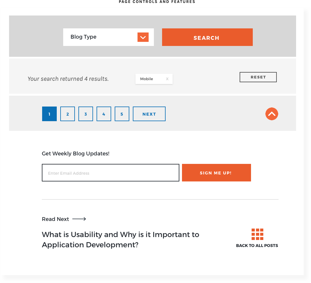
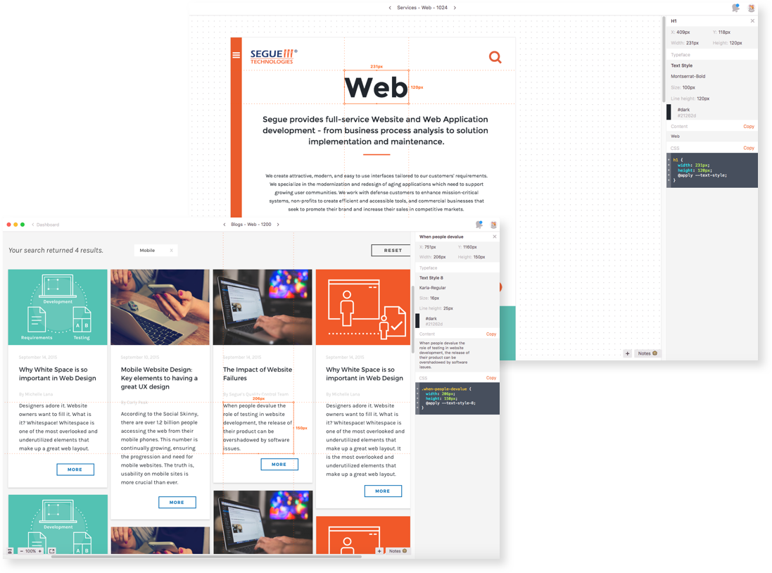
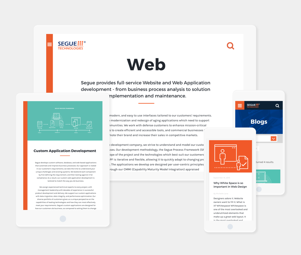
From there, I began to mockup the screens in Sketch using our new, revised stylesheets. Building the style inventory ahead of time made it really easy for me to layout pages and share them with our stakeholders. I uploaded all of the Sketch artboards to Zeplin to share with my Creative Director and our development team. I started refining the visual designs and certain parts of the user experience. I created custom icons for the search bar and a back-to-top button that would start grayed out and fill in with color when the user scrolled the page. I created sample CSS for these features so that the dev team could see how they functioned in real-time.
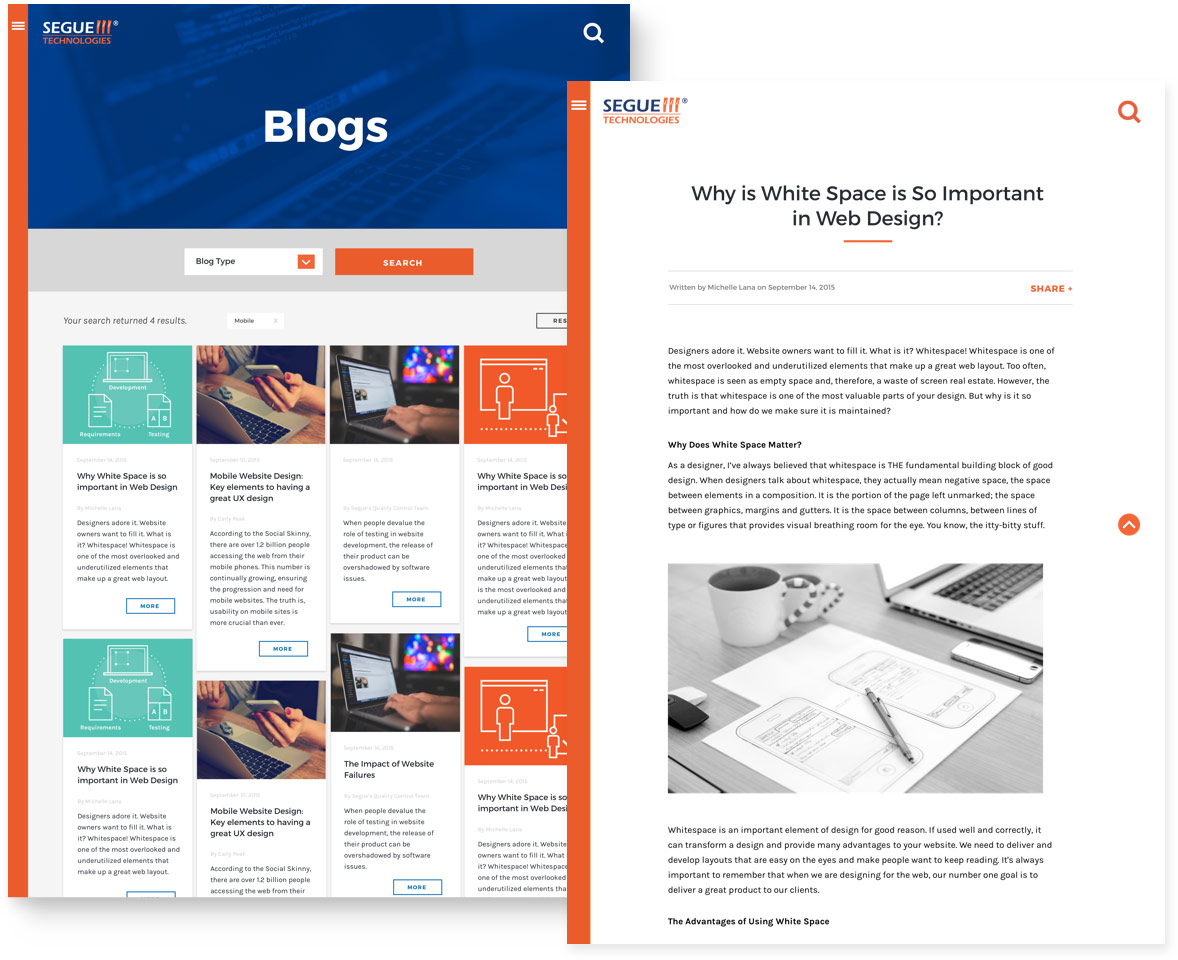
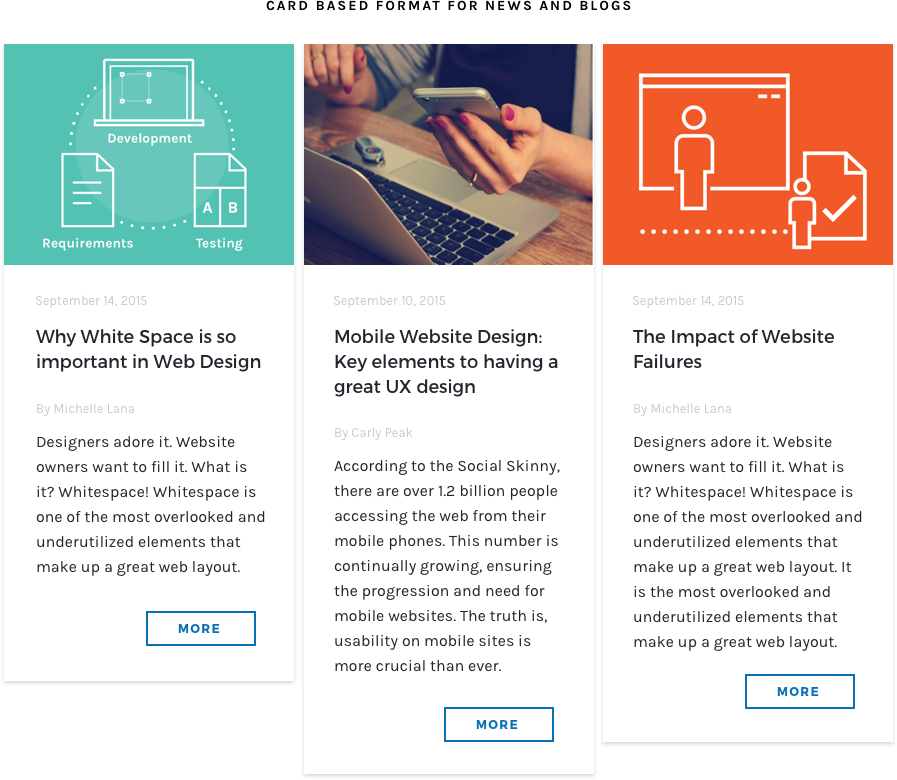
The blog section of our site is probably my favorite of all the pages. We wanted to stay true to the Segue brand and tie all the blog images into our current styling. Numerous visitors have found us through our blogs alone, and the images have been crucial and important to all of our blog content. I usually work with our Social Media manager for all of our blog images, and all illustrations are custom-made.
Using Sketch and Zeplin has been a great time saver for our creative team. Gone are the days when I had to spec every single page in Adobe Illustrator, where at times I found myself making mistakes in applying the styles as it was hard to keep up with the multitude of separate files. I have also learned that even if you have shipped a project, it doesn't mean that the project is done. Your work is always living and breathing and testing and iterating is a huge important part of the process. The design process can never be concrete and will always evolve with time. At the end of the day, it is always important to collaborate with your team, gather information and input early and often from peers, stakeholders, and users in the industry to create first-class designs and experiences.